Overview
There are numerous tables under the Utilization and Quality tab on the Facility Analyze page. These tables will help you to perform a detailed analysis of the selected facility's performance, specifically regarding care for hospice patients. The numerous metrics will help you to evaluate the facility's operational success as well as the post-acute experience of patients after discharge from the facility.
 Page Details
- In this article, "facility" could refer to any organization that treated patients who were subsequently admitted to hospice services. As a shorthand, you can think, hospitals and skilled nursing facilities, although it is possible to see home health agencies as sources of patients for hospices.
- Also, since many of the tables pertain only to metrics from inpatient claims, those tables will not appear on the facility Analyze page when viewing a selected skilled nursing facility, even if that facility treated numerous patients who were subsequently admitted to home health care.
- Chart View - At the top left of the page you will find a toggle icon that allows you to turn chart view on and off. With chart view on, some content will be shown as a chart, with chart view off, all content on the page will be shown in tables.
Chart View On |
Chart View Off |
 |
 |
|
Legend - Each chart has a legend that identifies the elements in the chart. Each different identifier in the legend can be toggled on and off to display or hide the matching elements in the chart
| |
 |
 |
 In this article
![]() In the following list of tables, any table that will appear as a chart with chart view turned on will show the Chart View icon - . The table titles in this table are links to the content for that table in the article below.
In the following list of tables, any table that will appear as a chart with chart view turned on will show the Chart View icon - . The table titles in this table are links to the content for that table in the article below.
| Patient Hospice Utilization - a measure of the aggregated flow of patients from the selected facility to hospice | |
|
| Trended Readmission Rates - shows the fluctuation of the facility's readmission rate over a 4 quarter period as compared to state and county benchmarks | |
|
| Hospice Length of Stay Post Discharge - trended length of stay metrics over the last four quarters of data for the selected facility | |
|
| Hospice Length of Stay Post Discharge - trended length of stay metrics over the last four quarters of data for the selected facility | |
|
| Hospice Timing | Hospice Timing - Medicare Cost of Care Impact - a visual analysis showing how earlier and longer hospice enrollment correlates with lower overall Medicare spend and reduced healthcare utilization in a patient’s final months of life. | |
| Hospice Timing - Utilization Impact - for patients treated by the selected facility, the table shows metrics for patients who received early hospice care, late hospice care, and no hospice care to prove the value of early hospice care. | ||
| Discharge Events by Setting - shows the flow of patients from the discharging facility to numerous post-acute destinations | |
|
| Adherence by Setting - Only shows with Chart View on - chart shows the adherence percentages for discharges from the selected facility for patients coded for home health, hospice, and skilled nursing | |
|
| Outcomes by Setting: Inpatient - provides insights into the post-acute care provided to patients discharged from the selected facility - mortalities and readmission rates | |
|
| Patient Diagnostic Mix - breaks down the selected facility's discharged patients by the principle diagnosis indicated on the discharge claim and provides metrics for trended patient counts, home health utilization, average length of stay, and readmission rates, with state and county comparisons. | ||
| Outpatient Groups - this table provides a breakdown of patients treated at the selected facility and identified as having received outpatient care on the claim | |
|
| Inpatient MS-DRG Breakout - breaks down the selected facility's patients by the MS-DRG indicated on the discharge claim and provides metrics for patient counts, average length of stay, and readmission rates, with state and county metrics included for comparison. | ||
| CMS TEAM Episode Category - patient counts, ALOS, and readmission rates for the selected facility broken out by the five CMS TEAM episode categories | ||
| BPCI Groups - breaks down the selected facility's patient counts by the BPCI bundled payment types and provides metrics for trended readmission rates, home health utilization, average length of stay, and readmission rates with state and county metrics included for comparison | ||
| Readmission Groups - patient counts, readmission rates, and Medicare reimbursement for patients admitted to the selected facility broken out by readmission groups | ||
Location
These tables will be found under the Utilization and Quality tab of the Analyze page for a selected facility.

Understanding the Metrics
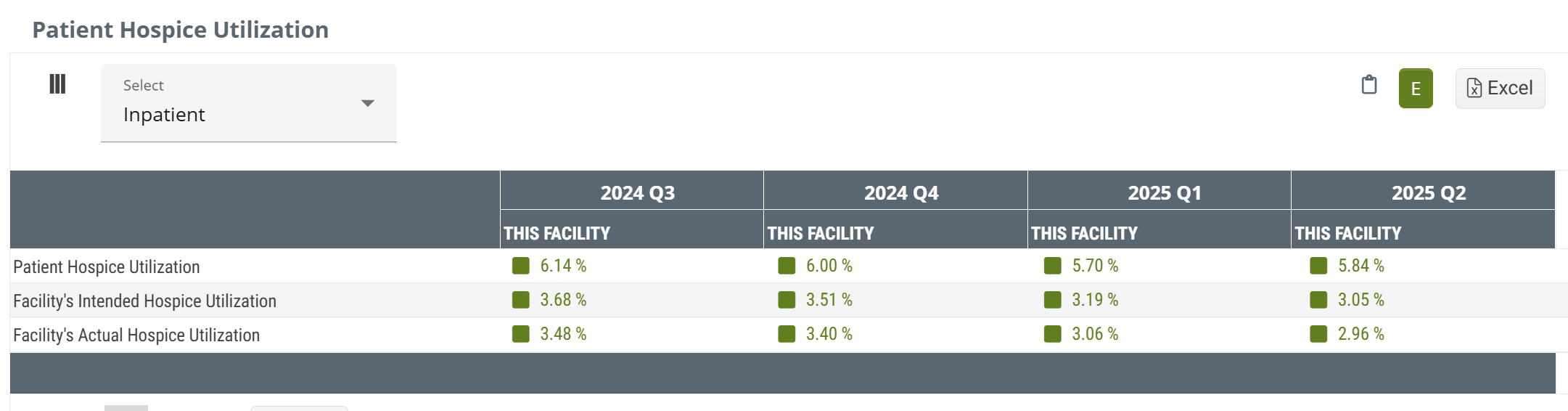
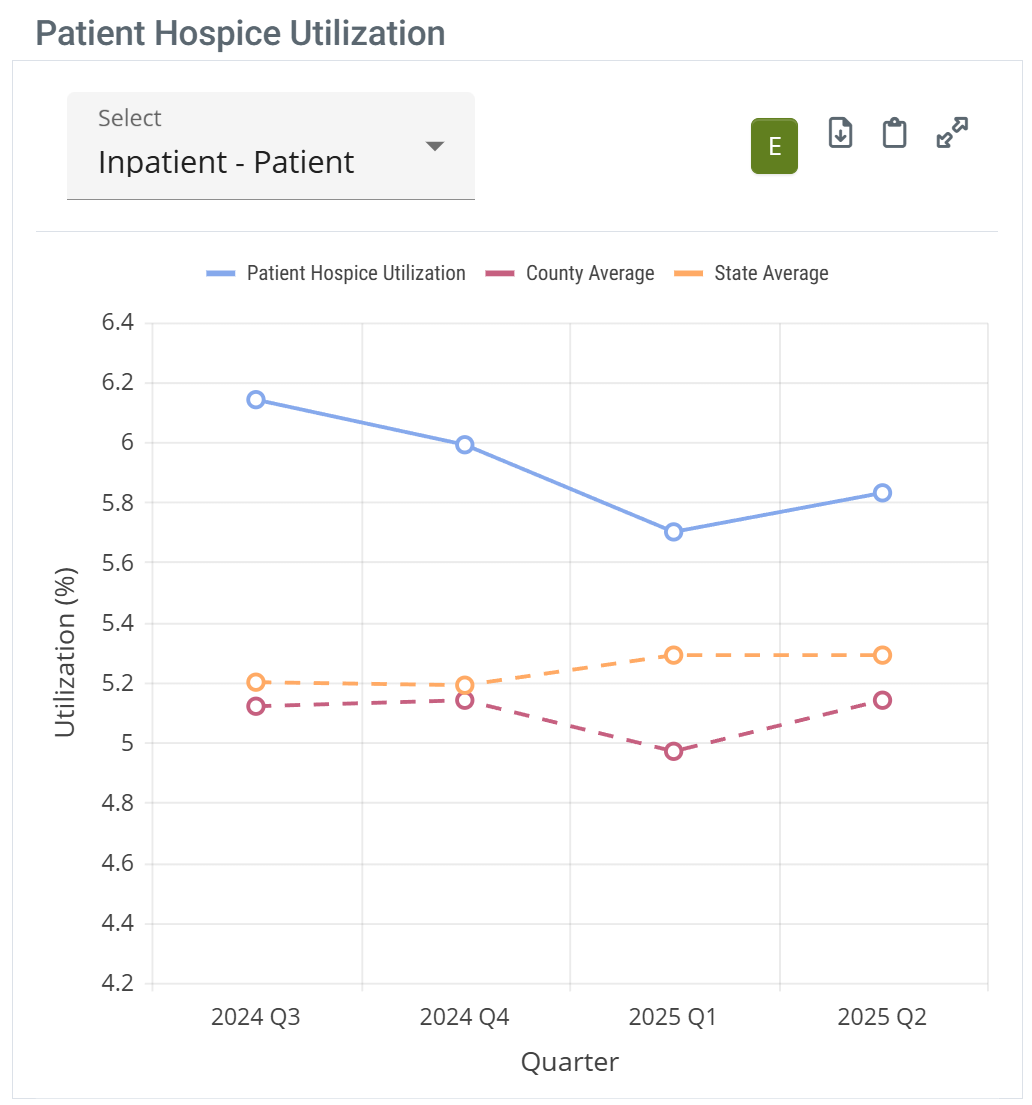
Patient Hospice Utilization table
The metrics in this table represent trended percentages, by quarter, of the selected facility's patients who were admitted to hospice care within 30 days of discharge from the selected facility during the one-year reporting period.
Data Presentation
|
Off
|
 |
|
|
On
|
 |
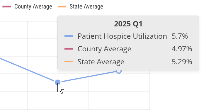
When you hover over a column in the Patient Hospice Utilization chart, the metrics for the data points for the trendlines are displayed. (image below) |
 | ||
![]() To enlarge an image, click on it.
To enlarge an image, click on it.
The metrics in this table are trended percentages, by quarter, of the selected facility's patients who were admitted to hospice care within 30 days of discharge from the selected facility during the one-year reporting period. Each metric is shown with the state and county averages for comparison.
Patient Hospice Utilization - (Entered)
This metric is the percentage of facility discharges that were admitted to hospice care within 30 days of discharge. This reflects a one-year reporting period ending in the specified quarter.
Consider the following simplified calculation.

This percentage is based on patients who were admitted to hospice care within 30 days of discharge from the selected facility and includes both patients intended for hospice care (coded for hospice care at discharge) and patients who were coded for other care.
Facility's Intended Hospice Utilization - (Intended)
Metrics in this row are the percentage of facility discharges that were coded for hospice care at discharge (% Coded). This reflects a one-year reporting period ending in the specified quarter.
The following image shows the basic formula.

As implied, this metric identifies the percentage of patients who were coded for hospice care at discharge, indicating that the intention was for the patient to seek hospice care after discharge. The percentage includes both patients who were admitted to hospice care and those who weren't admitted to hospice. Patients who weren't admitted to home care might have been admitted to other post-acute care.
Facility's Actual Hospice Utilization - (Adhered or Actual)
This is the percentage of facility discharges that were coded for hospice services who were admitted to hospice care within 30 days of discharge (% Adhered). This reflects a one-year reporting period ending in the specified quarter.
The following formula shows the numerator and denominator for this metric.

We call this metric "adhered" because the patient was coded for hospice and was admitted to hospice.
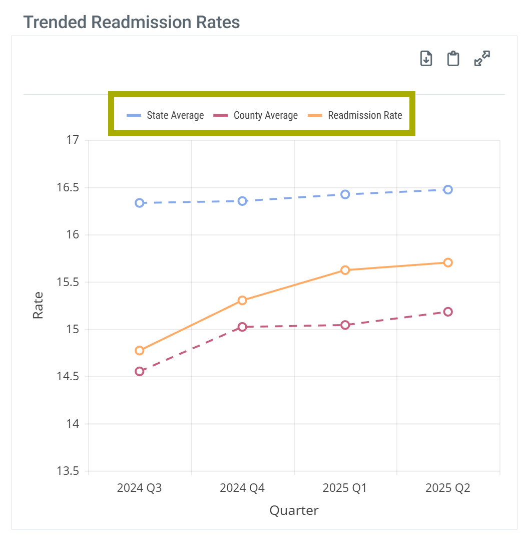
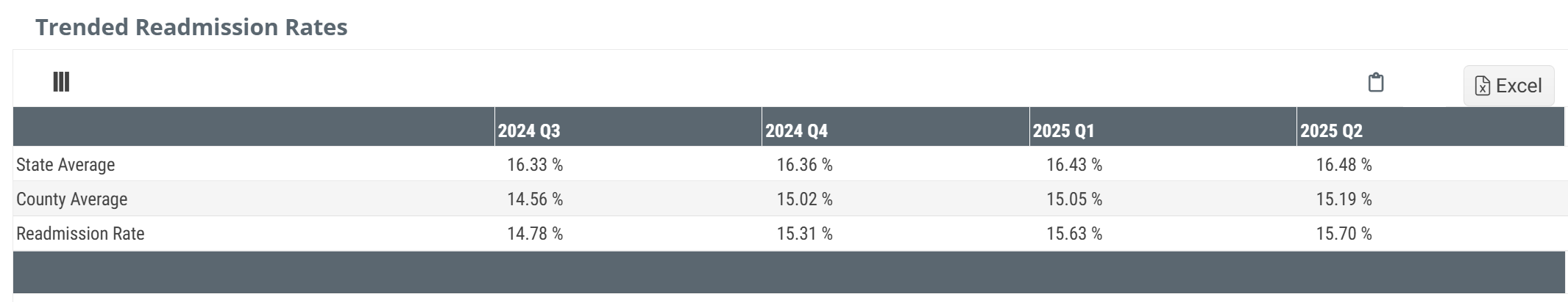
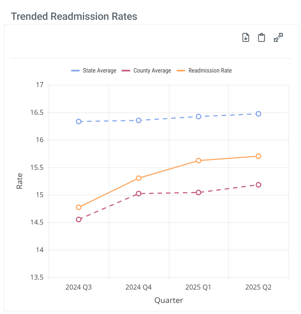
Trended Readmission Rates table
A readmission is a multi-claim event where a patient is discharged from an inpatient stay at a short term acute care hospital and is readmitted to inpatient care again within 30 days. This readmission scenario could include a post-acute stay, or multiple post-acute stays during that 30 day period. The goal of a readmission rate is to evaluate each facility's success at keeping patients out of the hospital.
Data Presentation
|
Off
|
 |
|
|
On
|
 |
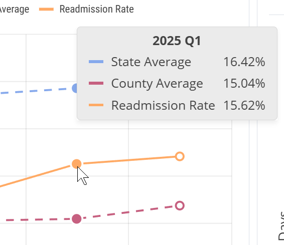
When you hover over a column in the Trended Readmission Rates chart, the metrics for the data points for the trendlines are displayed. (image below) |
 | ||
![]() To enlarge an image, click on it.
To enlarge an image, click on it.
This table includes a trend of readmission rates over the most recent four quarters. The state and county comparison metrics cover all similar facilities in the stated area for the same period.
![]() Because this metric is calculated for a one year period, this metric will not match other readmission rates listed under the last reported quarter in other locations in Trella Insights. In addition, because of the shortened reporting period, you will notice a higher number of Readmit rates that are not reported to comply with privacy suppression.
Because this metric is calculated for a one year period, this metric will not match other readmission rates listed under the last reported quarter in other locations in Trella Insights. In addition, because of the shortened reporting period, you will notice a higher number of Readmit rates that are not reported to comply with privacy suppression.
![]() For more information, see Readmission Rates also, Trended Readmission Rates.
For more information, see Readmission Rates also, Trended Readmission Rates.
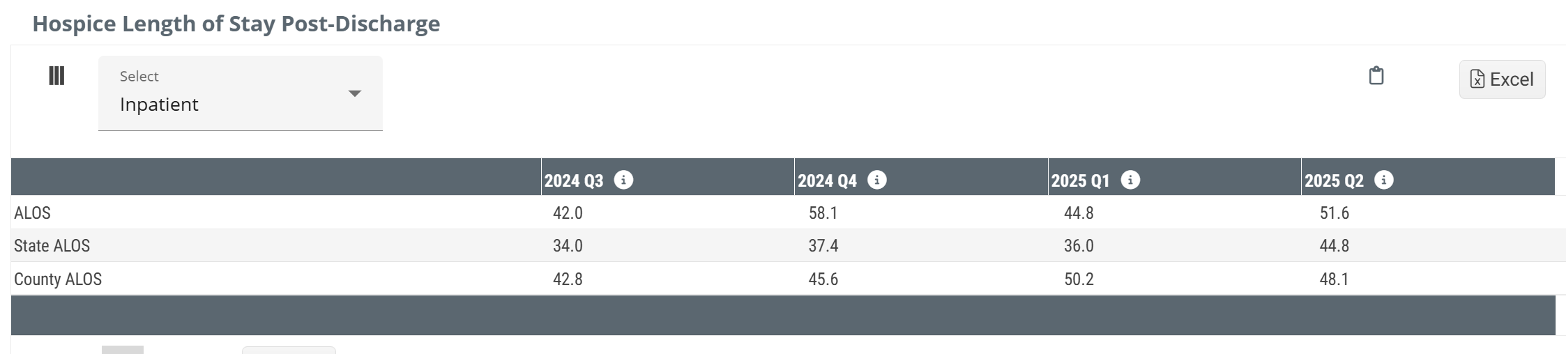
Hospice Length of Stay Post Discharge table
The table contains trended average length of stay metrics for the most recent four quarters with state and county averages for comparison.
Data Presentation
|
Off
|
 |
|
|
On
|
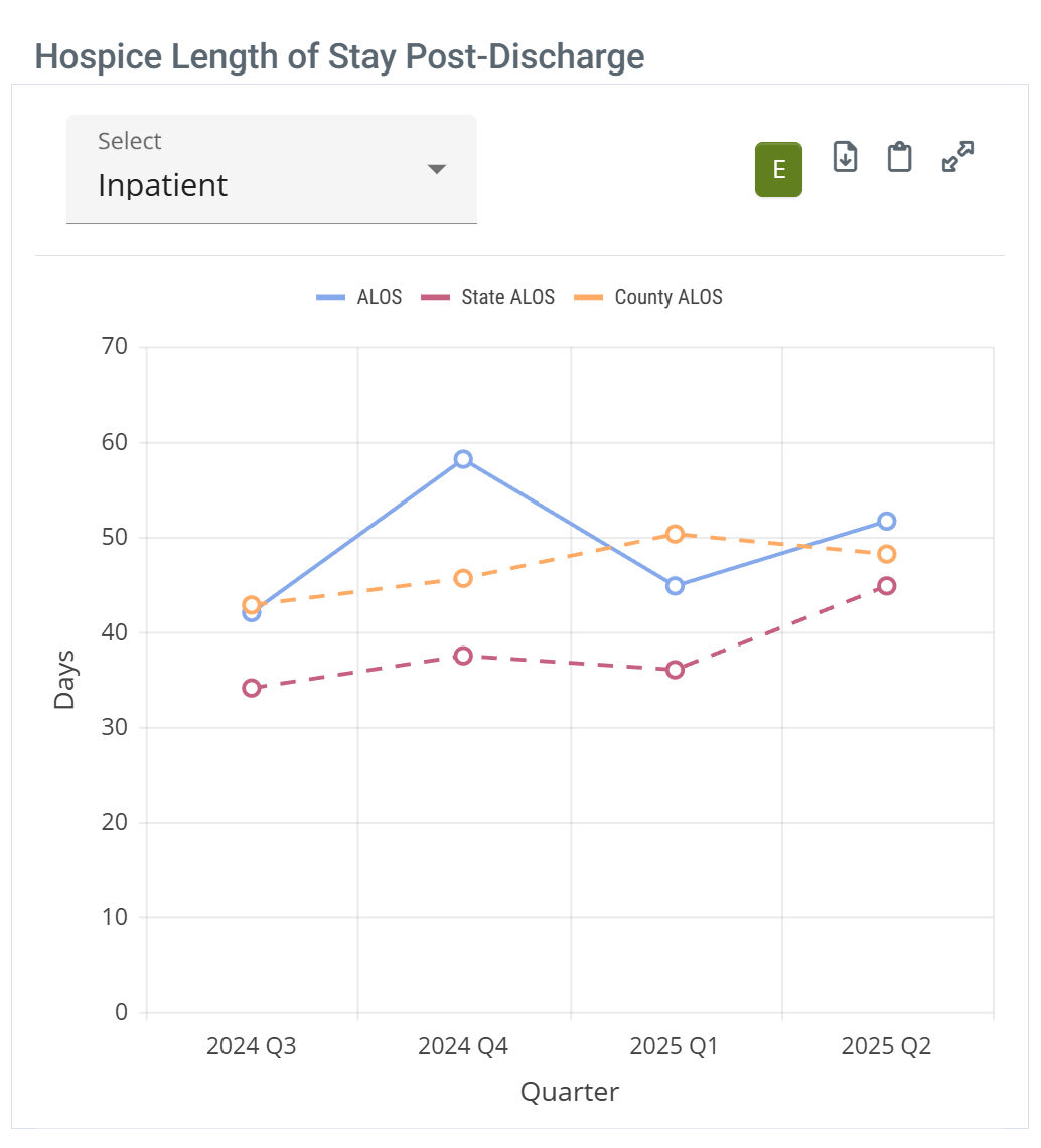 |
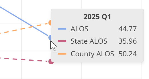
When you hover over a column in the Hospice Length of Stay Post-Discharge chart, the metrics for the data points for the trendlines are displayed. (image below) |
 | ||
![]() To enlarge an image, click on it.
To enlarge an image, click on it.
![]() Calculation
Calculation
How Trella Health calculates the metrics in this table:
- For a patient to be included in the count, they must have been admitted to hospice care within 30 days of discharge from the selected facility
- From those patients, we identify patients who were discharged from hospice care during the quarter listed in each column
- For patients that meet both of the above criteria, we calculate the total number of days those patients received hospice care, looking back for the date of admission up to two years from the end of the most recent quarter of data available
- To calculate the length of stay average, we divide that total number of days by the count of patients that met the original inclusion criteria
Because these metrics are calculated for a period of a single quarter, this metric will not match other average length of stay metrics listed under the last reported quarter in other locations in Trella Insights. This table is used specifically to identify quarter over quarter trends.
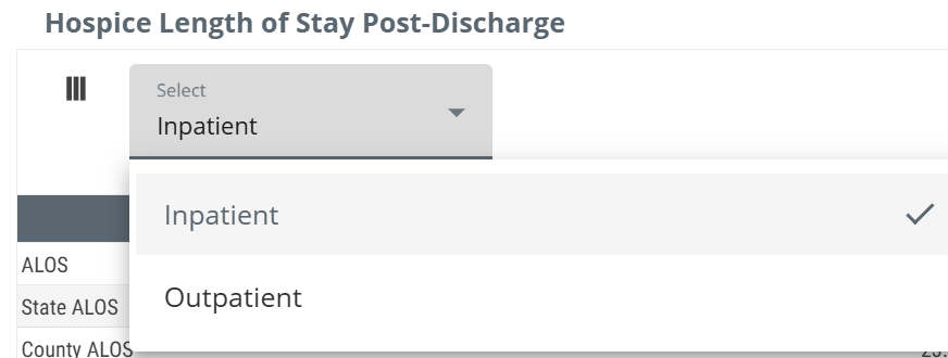
![]() The dropdown selector at the top-left of the table allows you to switch between inpatient and outpatient claims for patients discharged from the selected facility. The table will show length of stay counts that reflect your choice.
The dropdown selector at the top-left of the table allows you to switch between inpatient and outpatient claims for patients discharged from the selected facility. The table will show length of stay counts that reflect your choice.
![]() For more information, see Average Length of Stay.
For more information, see Average Length of Stay.
Hospice Timing - Two Tables
There are two related tables in this gray panel that are connected. The top table (or chart) shows costs of care for hospice patients during different periods of time, and for different patient types. The bottom table focuses specifically on the impact of patient utilization.
![]() The details for each table are shown below in the next two sections of this article. You can navigate directly using the following links.
The details for each table are shown below in the next two sections of this article. You can navigate directly using the following links.
![]() For a full presentation of the metrics and features in the Hospice Timing panel, see Hospice Timing - Cost of Care and Utilization.
For a full presentation of the metrics and features in the Hospice Timing panel, see Hospice Timing - Cost of Care and Utilization.
 Value
Value
Value Summary - It is impossible to overstate how conclusively these detailed hospice timing metrics prove that getting patients into hospice care earlier positively impacts costs and utilization. Consider the following:
 Quantifies impact with real patient data
The tables provide proof that you can provide to referring physicians and facilities how the timing of hospice enrollment affects their own patients spend, utilization, and care intensity.
 Reveals high value education opportunities
The tables demonstrate the impact of late transitions and how they result in unnecessary hospitalizations, readmissions, or higher spend — arming reps with objective, claims-backed talking points.
 Provides state and national benchmarks for comparison
The metrics in these tables contextualize performance against broader trends, helping organizations uncover gaps and opportunities for improvement.
 Supports value-based care alignment
The tables enable providers to demonstrate the financial and clinical benefits of timely hospice enrollment to partners seeking improved quality and coordination.
![]() The point of all of the metrics in these tables is to prove the value of earlier hospice for dying patients. To do so, all of the costs during the time periods are calculated backward from the deaths of the patients included in the metrics.
The point of all of the metrics in these tables is to prove the value of earlier hospice for dying patients. To do so, all of the costs during the time periods are calculated backward from the deaths of the patients included in the metrics.
Data Presentation
|
Off
|
 |
|
On
|
 |
Filters
This panel provides flexibility that allows you to evaluate hospice timing for different patient populations for the selected provider. Each dropdown selector is described below.
![]() The specific metrics that appear in the both tables are determined by the choices you make.
The specific metrics that appear in the both tables are determined by the choices you make.
|
Patient Types - this dropdown allows you to choose between three patient type categories. Each are described below.
|
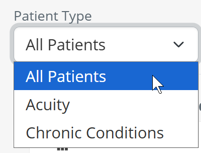 |
| All Patients - with this selection, all patients discharged from the selected provider will be used to calculate the metrics shown in the table. | 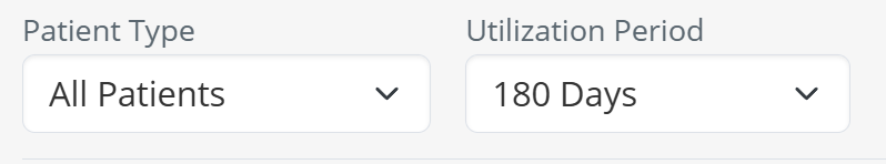 |
|
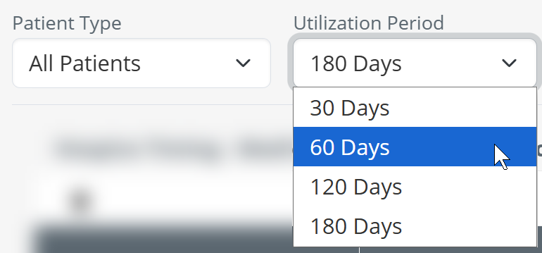
Lookback Period Before Death - You can select the length of time from which patients will be included in the calculations for the metrics in the table.
|
 |
|
Acuity - You can select to filter patients by their acuity.
|
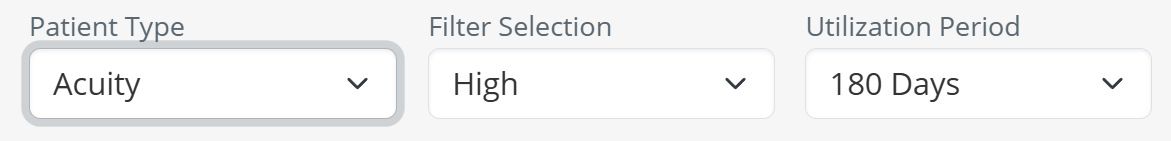 |
| Acuity Level - if you use the Acuity patient type, you can then use the second dropdown to choose a specific acuity level. | 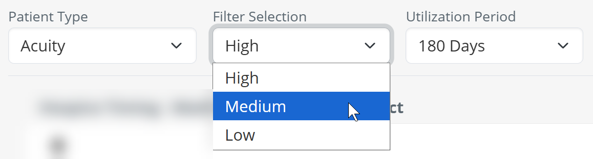 |
| Lookback Period Before Death - once you have chosen an acuity level, you can choose to filter the results in the table to a specific period using the third dropdown. | 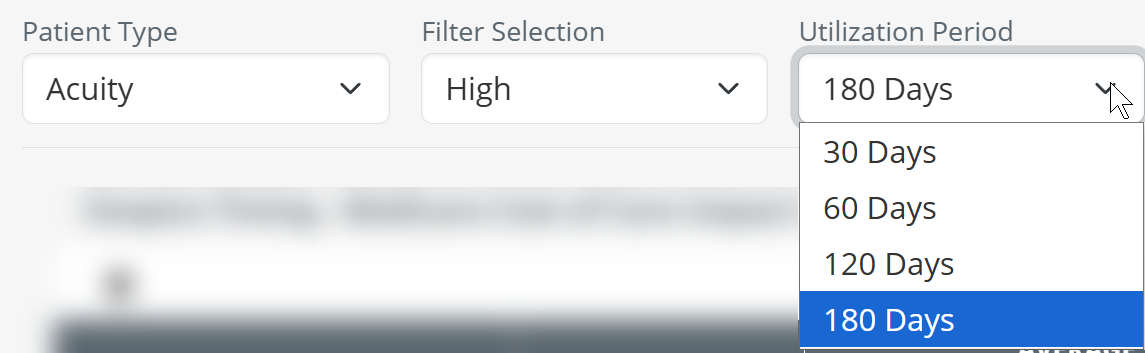 |
| Chronic Condition - the third patient type that you can choose is chronic condition. | 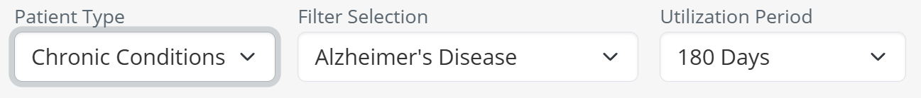 |
|
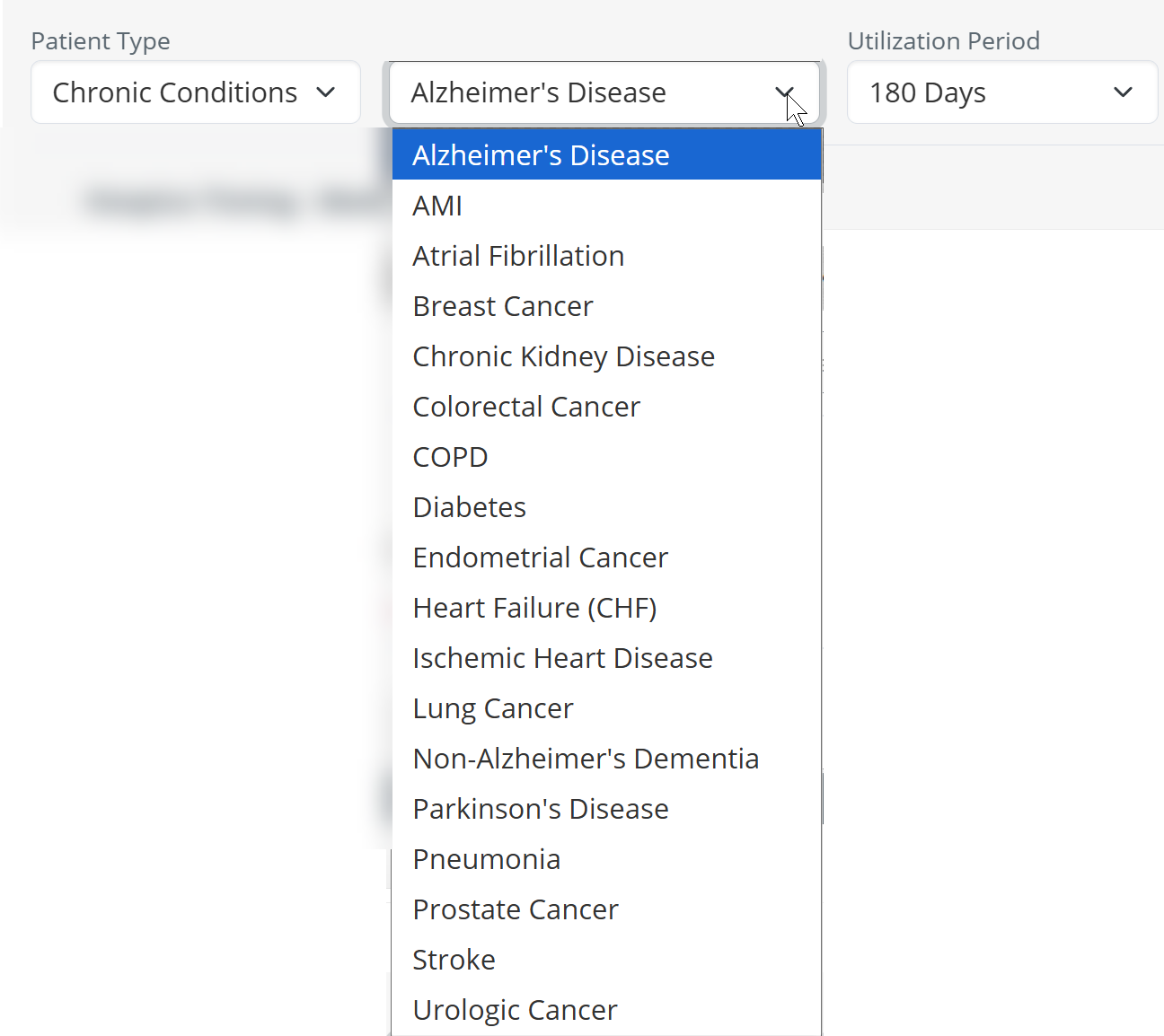
Choose a chronic condition - if you choose the Chronic Condition patient type, you then have the option to select a specific chronic condition from the second dropdown. The chronic conditions available are shown in the image to the right.
|
 |
| Lookback Period Before Death - after you have chosen a specific chronic condition, you can choose to filter the results in the table to a specific period using the third dropdown. | 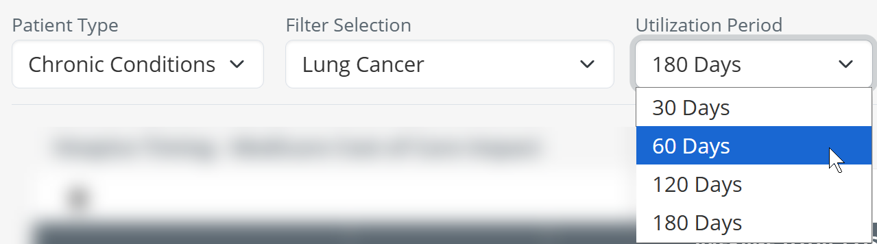 |
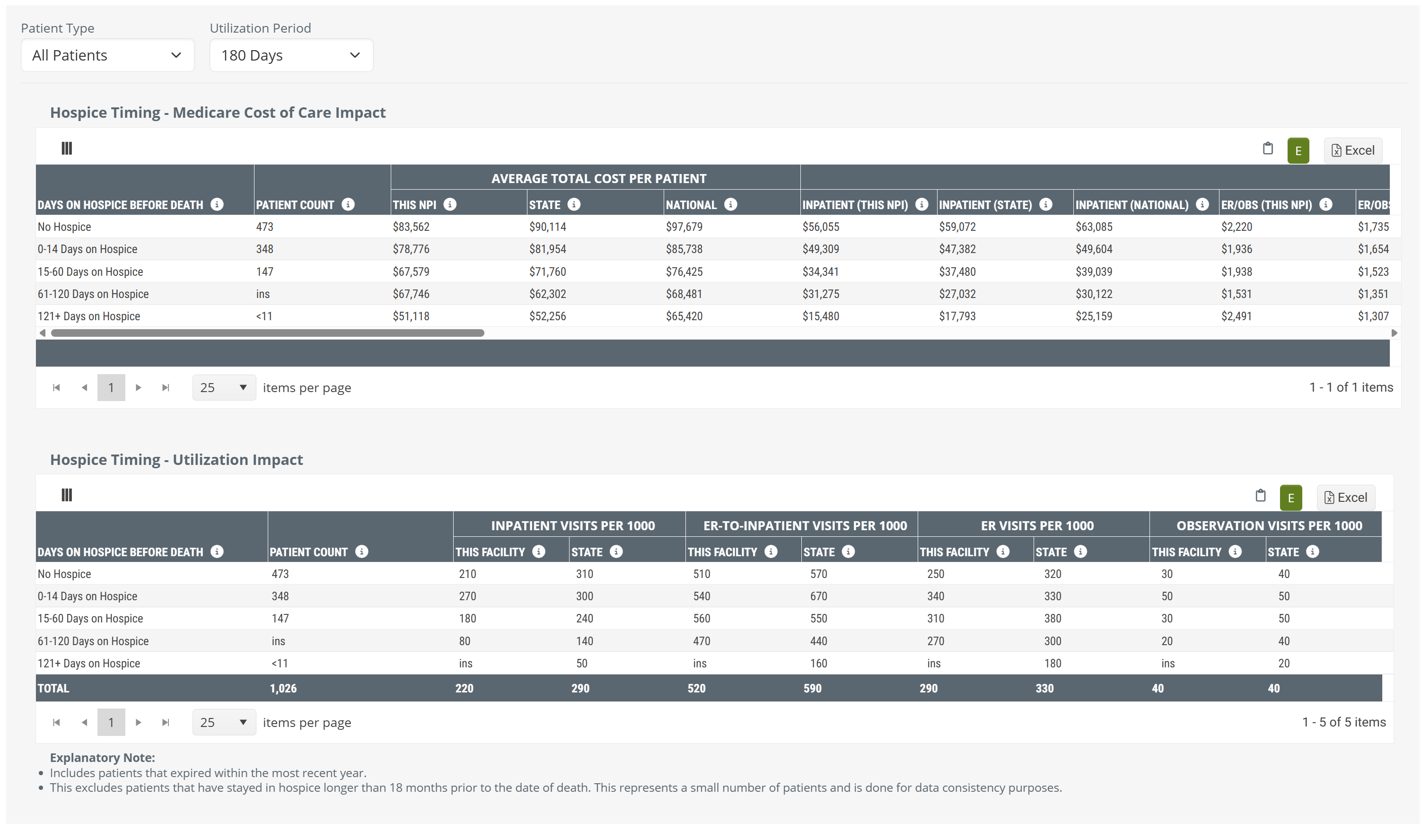
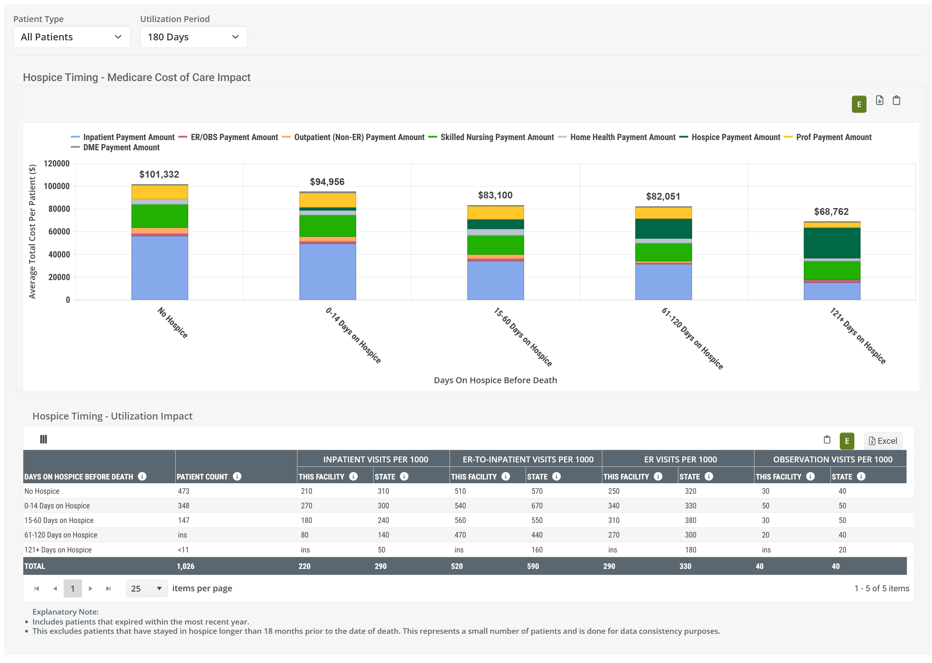
Hospice Timing - Medicare Cost of Care Impact table and chart
The top table in the hospice timing panel focuses on the impact of earlier hospice care on costs.
Data Presentation
The metrics in the Medicare Cost of Care Impact table can be viewed as a table or as a chart.
|
Off
|
 |
|
On
|
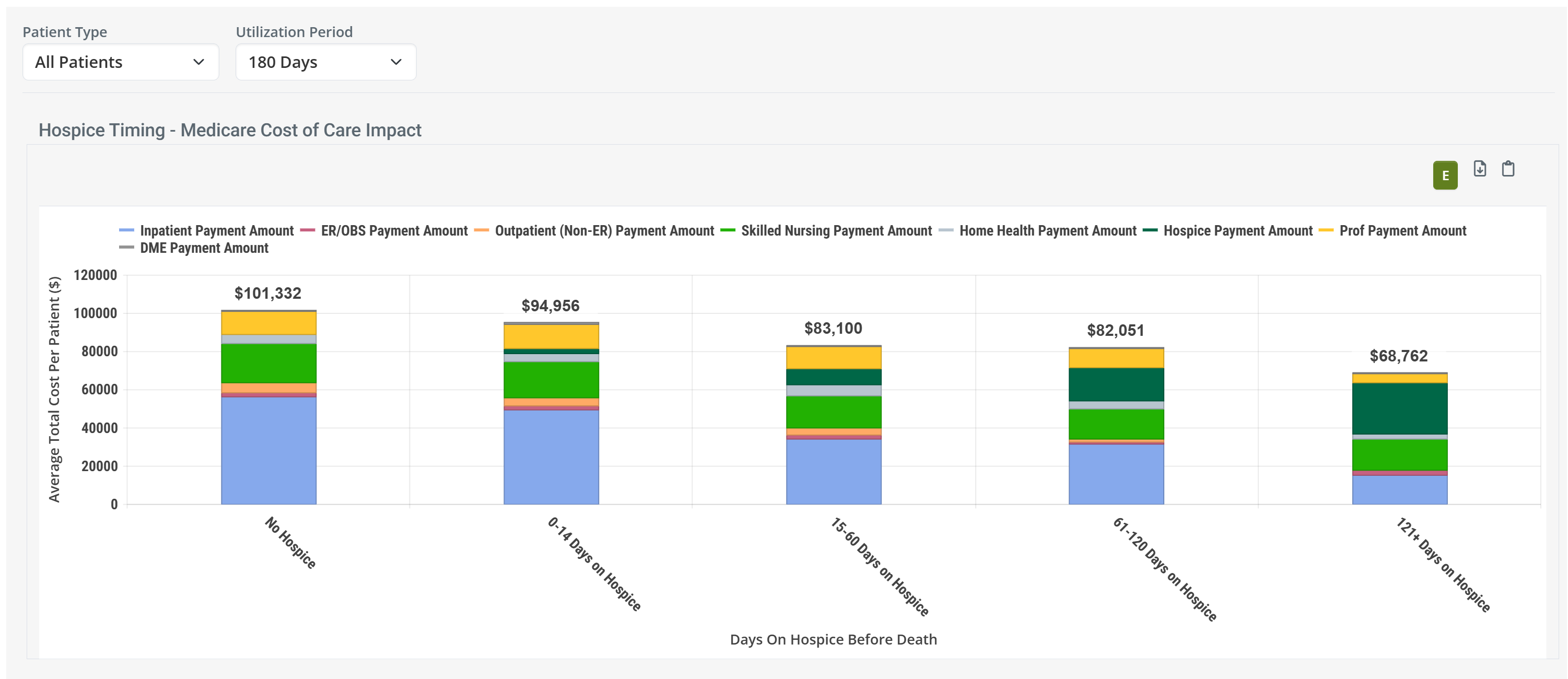 |
| When you hover over a bar in the Hospice Timing - Medicare Cost of Care Impact chart, the metrics for the different provider types represented in the chart are displayed. (image below) | 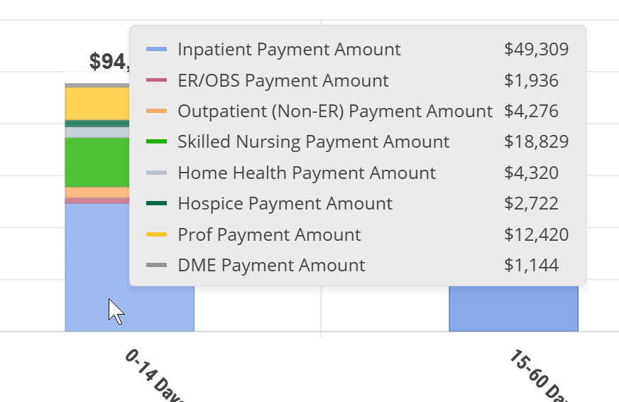 |
![]() To enlarge an image, click on it.
To enlarge an image, click on it.
Value
The metrics in this table are designed to:
- Furnish insights into the financial and utilization impact of hospice timing on your own patient population
- Help hospice providers identify and enroll patients earlier, improving patient care while improving financial performance
- Provide benchmarking against state and national averages to guide clinical and operational strategies
But let's make this simple: Behold a convincing example.
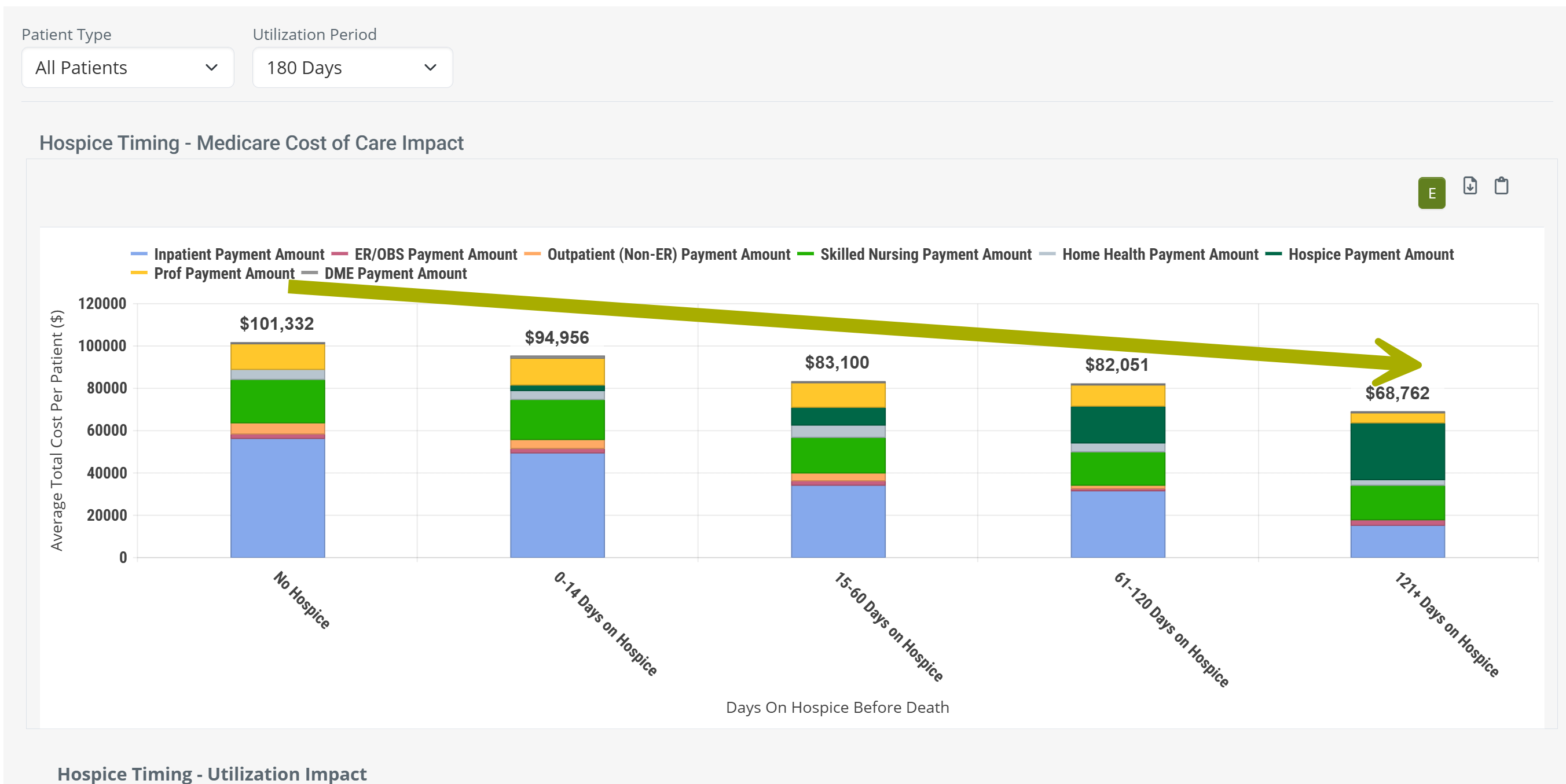
![]() Observations
Observations
- The chart shows the cost improvements from hospice, instantly and obviously.
- Being admitted to any level of hospice saves money over no hospice care.
- Longer stays save costs over shorter stays.
- Hospice is good, use hospice.
And, yes, you can customize the chart to show the same kind of trend for patients with different acuity levels and different chronic conditions. Customize your proof to numerous specific situations.
 Calculation
To determine which patients are included in costs, and to confirm which costs are counted, there are a few limits that are helpful to understand.
- Index event - since the Hospice Timing tables are designed to show the value of hospice, we start by identifying a patient's death. To be included in these metrics, the patient must have died. Patients who are still on hospice during the reporting period are not included in Hospice Timing metrics.
- Reporting period - the patient's death must have occurred during the one-year reporting period. This is the one-year period period ending on the last day of the most recently released data.
| The one year reporting period is identified at the top right of every page in Trella Insights. The relevant reporting period for this table is "Medicare Fee for Service (FFS)". The reporting period changes with each new release. |  |
- Discharge Reference period - from the patients who died during the reporting period, only patients who died within 180 days of discharge from the selected facility are included in the metric calculations.
-
No Hospice/Length of Stay - for patients that meet all of the above requirements, we break them up into the five categories shown in the chart and the table. The costs for these patients are displayed.
- No Hospice
- 0-14 Days on Hospice
- 15-60 Days on Hospice
- 61-120 Days on Hospice
- 121+ Days on Hospice
- Patient Type - You are able to use the dropdown filters to further limit the population from which the metrics are calculated into all patients, patients of a specific acuity level, and patients with specific chronic conditions.
- Lookback Period - Finally, you are able to choose a length of time from which the costs are calculated, 30 days, 60 days, 120 days, and 180 days. Use the image and examples below to see how costs are calculated.
| The Lookback Period Before Death is selected using the dropdown filter at the top left of the panel. | |
Examples
Patient 1 was discharged 171 days before death and was on hospice care for the last 51 days.
- If we choose a 30 day period, only costs in the last 30 days would be counted. The costs would be used in the average for the column, 121+ days on Hospice, because the patient was on hospice 148 days.
- If we choose a 60 day period, costs that occurred in the last 60 days would be counted. The costs would be used in the average for the column, 121+ days on Hospice, because the patient was on hospice 148 days.
- If we choose a 120 day period, costs that occurred in the last 120 days would be counted. The costs would be used in the average for the column, 121+ days on Hospice, because the patient was on hospice 148 days.
- If we choose a 180 day period, costs that occurred in the last 180 days would be counted, even though some costs occurred prior to their hospice stay, and prior to their discharge. The costs would be used in the average for the column, 121+ days on Hospice, because the patient was on hospice 148 days.
Patient 2 was discharged 47 days before death and was on hospice care for the last 19 days.
- If we choose a 30 day period, only costs in the last 30 days would be counted, even though some costs occurred prior to hospice care. The costs would be used in the average for the column, 15 - 60 days on Hospice, because the patient was on hospice 19 days.
- If we choose a 60 day period, costs that occurred in the last 60 days would be counted, even though some costs occurred prior to hospice care, and prior to their discharge. The costs would be used in the average for the column, 15 - 60 days on Hospice, because the patient was on hospice 19 days.
- If we choose a 120 day period, costs that occurred in the last 120 days would be counted, even though some costs occurred prior to their hospice stay, and prior to their discharge. The costs would be used in the average for the column, 15 - 60 days on Hospice, because the patient was on hospice 19 days.
- If we choose a 180 day period, costs that occurred in the last 180 days would be counted, even though some costs occurred prior to their hospice stay, and prior to their discharge. The costs would be used in the average for the column, 15 - 60 days on Hospice, because the patient was on hospice 19 days.
Patient 3 was discharged 116 days before death and was on hospice care for the last 51 days.
- If we choose a 30 day period, only costs in the last 30 days would be counted. The costs would be used in the average for the column, 15 - 60 days on Hospice, because the patient was on hospice 51 days.
- If we choose a 60 day period, costs that occurred in the last 60 days would be counted, even though some costs occurred prior to hospice care. The costs would be used in the average for the column, 15 - 60 days on Hospice, because the patient was on hospice 51 days.
- If we choose a 120 day period, costs that occurred in the last 120 days would be counted, even though some costs occurred prior to their hospice stay, and prior to their discharge. The costs would be used in the average for the column, 15 - 60 days on Hospice, because the patient was on hospice 51 days.
- If we choose a 180 day period, costs that occurred in the last 180 days would be counted, even though some costs occurred prior to their hospice stay, and prior to their discharge. The costs would be used in the average for the column, 15 - 60 days on Hospice, because the patient was on hospice 51 days.
![]() The image above has all three patients day of death the same in order to simplify the illustration. In real life, the dates of death could at any time in the one year reporting period and we would then look back from that date.
The image above has all three patients day of death the same in order to simplify the illustration. In real life, the dates of death could at any time in the one year reporting period and we would then look back from that date.
Chart versus Table
Since the content in the chart view and table view are the same, but presented differently, let's compare using the following image.
The image shows a small section of the table view with a section of the chart above including the metrics that are displayed when you hover over a bar in the chart. Specifically, we hovered over the "No Hospice" bar.
Things to notice:
- Most obviously, the table view has a lot more metrics. What is visible is less than a third of the complete table. Details! Get your details here!
- The chart makes it much easier to visualize trends.
- When you hover, you reveal specific metrics from the table. The arrows above show how the same metrics, related to your selected NPI, are included in the chart. The rest of the metrics shown in the hover are in the part of the table to the right that is not being shown.
- The table, in addition to other metrics, includes the state and national averages for comparison.
![]() We strongly suggest comparing the table to the chart. The chart is a powerful visual presentation that shows how earlier hospice impacts costs and utilization. The table provides a lot more detail for comparison and evaluation.
We strongly suggest comparing the table to the chart. The chart is a powerful visual presentation that shows how earlier hospice impacts costs and utilization. The table provides a lot more detail for comparison and evaluation.
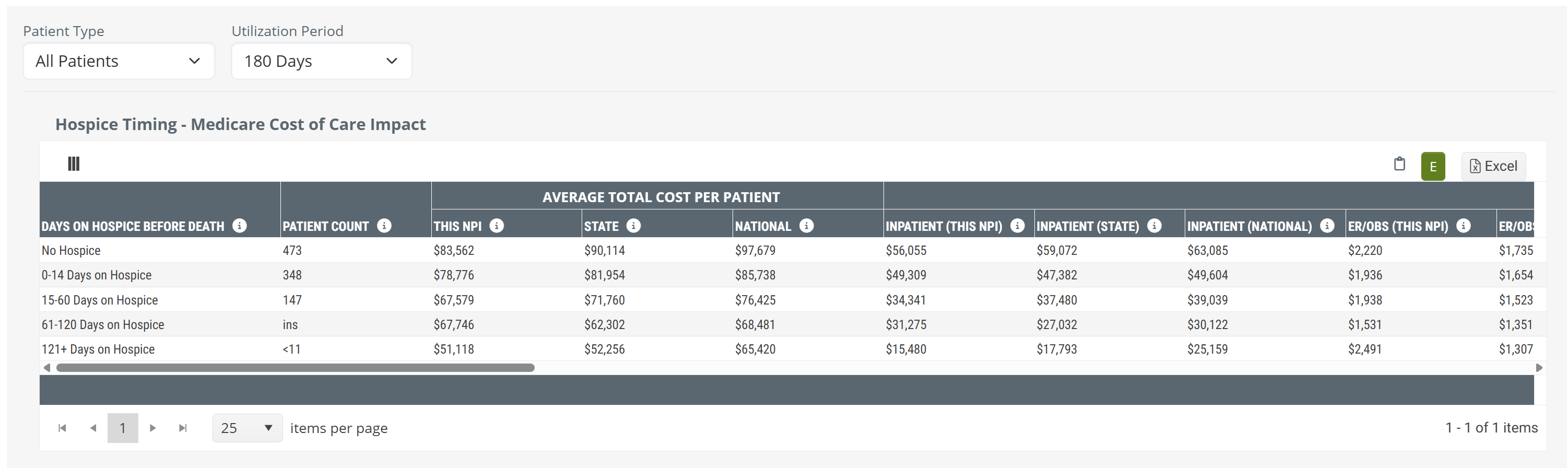
Metric Details - Hospice Timing - Medicare Cost of Care Impact
The table includes ALL of the metrics included in the chart and more. The following list shows all metrics in the table which are also shown in the chart. Use the following image to compare to what you see on the Analyze page.
![]() We broke the table up into parts so that the whole table is presented in a way that is more readable. You can click on the above image to enlarge it, of see the complete table, here.
We broke the table up into parts so that the whole table is presented in a way that is more readable. You can click on the above image to enlarge it, of see the complete table, here.
Metric Name |
Description |
|
| Days on Hospice before Death | This column shows the reference time period from which the metrics in the same row are calculated. For example, the row "No Hospice" calculates metrics from claims of patients discharged from the selected facility who died without receiving any hospice care. The remaining rows contain metrics for patients who received the listed number of days under hospice care. | |
| Patient Count |
The count of distinct patients who died during the most recent 4 quarters who were discharged from the selected facility up to 6 months (180 Days) prior to death and who received the length of care listed in the row. |
|
|
| ||
|
Average Total Cost Per Patient |
Average total Medicare spend for patients discharged from the selected facility who received the length of care listed in the row.
|
|
|
Average Category Cost per patient
|
Inpatient | The average Medicare spend per patient on Inpatient claims (includes LTACH & IRF) for patients discharged from the selected facility up to six months prior to death and who received the length of hospice care listed in the row. |
| ER/OBS | The average Medicare spend per patient on ER and observation claims for patients discharged from the selected facility up to six months prior to death and who received the length of hospice care listed in the row. | |
| Outpatient | The average Medicare spend per patient on outpatient claims for patients discharged from the selected facility up to six months prior to death and who received the length of hospice care listed in the row. | |
| SNF | The average Medicare spend per patient on skilled nursing claims for patients discharged from the selected facility up to six months prior to death and who received the length of hospice care listed in the row. | |
| Home Health | The average Medicare spend per patient on home health claims for patients discharged from the selected facility up to six months prior to death and who received the length of hospice care listed in the row. | |
| Hospice | The average Medicare spend per patient on hospice claims for patients discharged from the selected facility up to six months prior to death and who received the length of hospice care listed in the row. | |
| Professional | The average Medicare spend per patient on professional (Part B) claims for patients discharged from the selected facility up to six months prior to death and who received the length of hospice care listed in the row. | |
| DME | The average Medicare spend per patient on DME claims for patients discharged from the selected facility up to six months prior to death and who received the length of hospice care listed in the row. | |
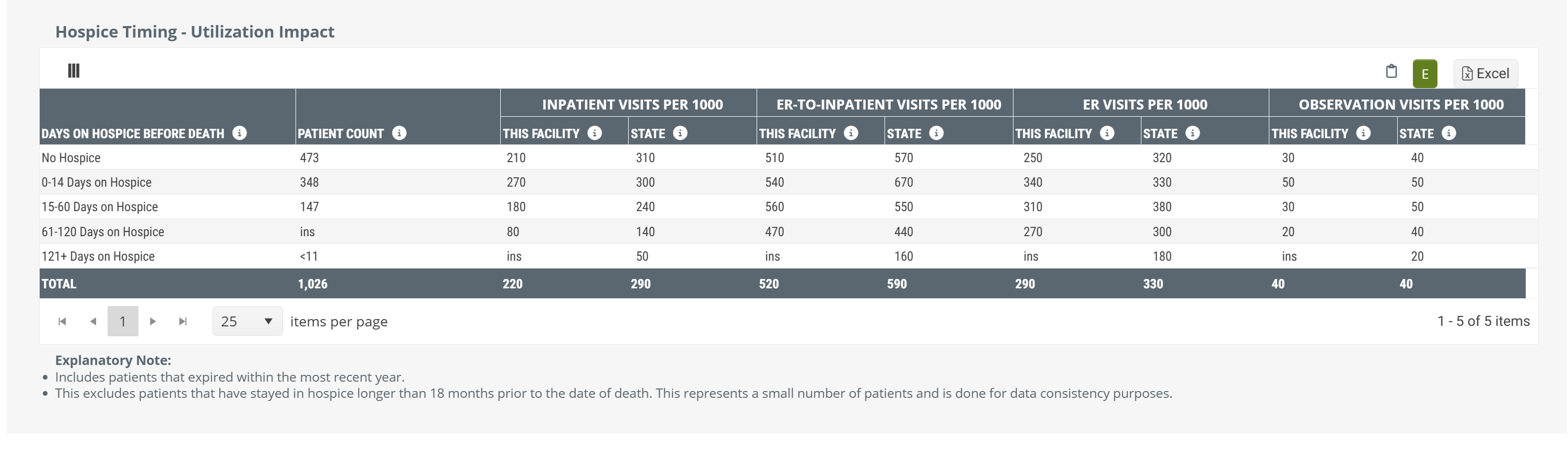
Hospice Timing - Utilization Impact table
For patients treated by a selected facility who died, we break that population into the following categories:
- No Hospice
- 0-14 Days on Hospice
- 15-60 Days on Hospice
- 61-120 Days on Hospice
- 121+ Days on Hospice
You can see these categories listed on the left side of the pictured table.
Data Presentation
|
Off
|
 |
|
On
|
There is no chart view for the metrics in this table. The table above is shown with Chart View on. |
![]() To enlarge an image, click on it.
To enlarge an image, click on it.
For each of these categories, this table provides overall patient counts for each category, and projected counts (per 1000 patients) for each of four different hospital levels of care.
 Value
Value
In light of the cost savings and benefits to patients and families that hospice care provides over hospitals for patients near the end of life, this table verifies the value of hospice care. For example, for each type of hospital visit, the table shows that early admission into hospice care is better than later admission, and that any hospice care is better than no hospice care at all.
This table makes it almost too easy to prove that getting hospice appropriate patients admitted to hospice care early is preferable. If you want to use these metrics in this way, most of the time you can prove this point using either the provider's metrics or the state averages.
Metric Name |
Description |
| Days on Hospice before Death | This column shows the reference time period from which the metrics in the same row are calculated. For example, the row "No Hospice" calculates metrics from claims of patients discharged from the selected facility who died without receiving any hospice care. The remaining rows contain metrics for patients who received the listed number of days under hospice care. |
| Patient Count | The count of distinct patients who died during the most recent 4 quarters who were discharged from the selected facility up to 6 months (180 Days) prior to death and who received the length of care listed in the row. |
| Inpatient | The average number of inpatient visits (not through the ER) per 1,000 patients who received the length of care listed in the row. |
| ER-to-Inpatient Visits per 1000 | The average number of inpatient visits (admitted through the ER) per 1,000 patients who received the length of care listed in the row. |
| ER Visits per 1000 | The average number of ER visits discharged home (not admitted to inpatient or observation) per 1,000 patients who received the length of care listed in the row. |
| Observation Visits per 100 | The average number of observation visits per 1,000 patients who received the length of care listed in the row. |
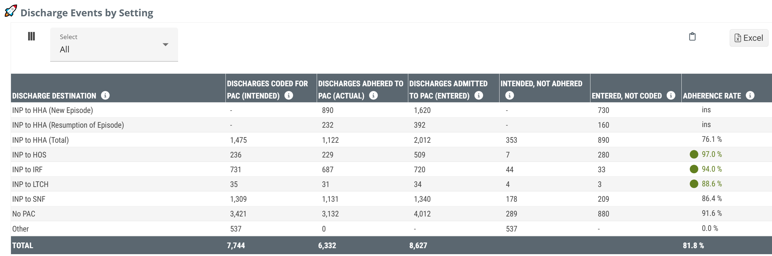
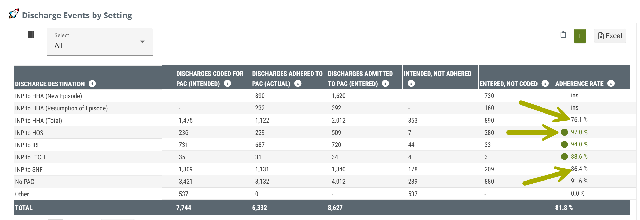
Discharge Events by Setting - Inpatient table
Imagine that a patient is about to be discharged from a hospital. The discharge planning team evaluates the patient and determines that the patient should continue care from a specific type of post-acute provider. They record this "status" on the discharge claim. This table shows the collection of those discharge events and the outcomes for those patients as they moved on from the selected facility to additional care.
![]() Notice that the table is titled, Discharge Events. The reason is that the counts in this table are not counts of patients. If a single patient had multiple discharges during the reporting period, each discharge would be counted in this table.
Notice that the table is titled, Discharge Events. The reason is that the counts in this table are not counts of patients. If a single patient had multiple discharges during the reporting period, each discharge would be counted in this table.
However, If you think of an individual patient, for a moment, this will make the table more clear. There are a few possible scenarios from the perspective of hospice providers:
- The patient had a status for hospice care at discharge, and the patient was admitted to hospice care. We call this adherence. (In the table, this is the column, Discharges Adhered to PAC (Entered).)
- The patient had any other status than hospice at discharge, and the patient was admitted to hospice care. (This column would be Entered not Coded, that is, the patient entered home health care even though not coded to seek home health care at discharge.)
- The patient had a status for hospice care at discharge, but the patient either didn't receive any post-acute care, or the patient was admitted to another form of post-acute care. (Patients who follow this path are counted in the column, Intended, Not Adhered.)
![]() For more information, see How does Trella Health Identify Status Coding?
For more information, see How does Trella Health Identify Status Coding?
Data Presentation
|
Off
|
 |
|
|
On
|
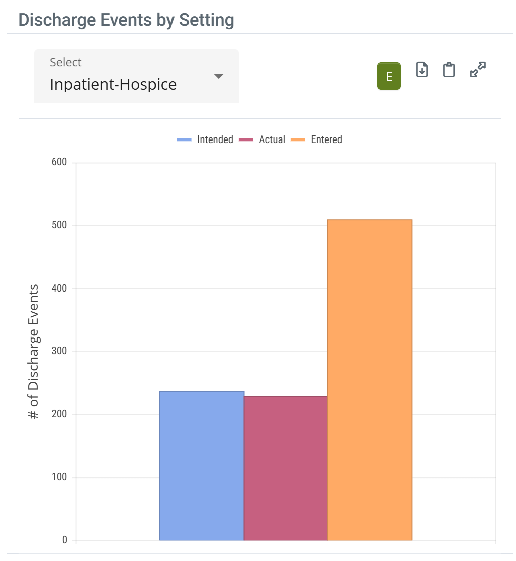 |
When you hover over a column in the Discharge Events by Setting chart, the metrics for the data points for all bars are displayed. (image below) |
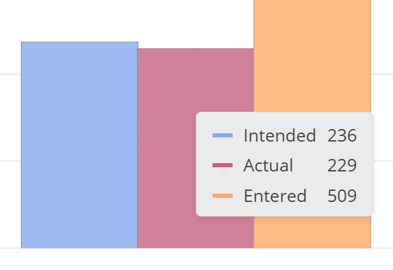 | ||
![]() To enlarge an image, click on it.
To enlarge an image, click on it.
TEAM Insights
|
The dropdown at the top left of the table allows you to choose one of the five TEAM Episode categories. Selecting a specific category will limit the metrics in the Discharge Events by Setting table to discharges from the selected hospital that align with the selected chosen category. Click on a single option from the dropdown list. |
 |
Metrics Summary
- Discharge Destination - think of this as Patient Pathway. In this column we identify which post-acute destination the inpatient discharges were admitted to.
![]() Example: INP to HOS indicates that the metrics in this row pertain to patients who were discharged from inpatient care and were admitted to hospice care.
Example: INP to HOS indicates that the metrics in this row pertain to patients who were discharged from inpatient care and were admitted to hospice care.
- Discharges Coded for PAC (Intended) - This is the count of discharge events that were coded with the status that aligns with the post-acute care listed in the same row. From the image above, for INP to HOS, the number 236 indicates the number of discharges during the reporting period for which the status coding indicated hospice as the "intended" next post-acute care for those patients discharged.
![]() It is important to remember that status coding does not equate to a referral, further guidance, or teaching in any way with regard to additional care. We use this table to understand the flow of patient populations and how well they align with discharge expectations.
It is important to remember that status coding does not equate to a referral, further guidance, or teaching in any way with regard to additional care. We use this table to understand the flow of patient populations and how well they align with discharge expectations.
- Discharges Adhered to PAC (Actual) - In short, this column contains the count of discharges where the patient was coded for the type of post-acute care listed in the row and the patient was admitted to that level of care within 30 days of discharge. In short, the patients who adhered to instructions implied by the status coding.
![]() Special example: in the row INP to HOS, the discharges would be counted in the Discharges Adhered to PAC column if the patient was discharged, was admitted to SNF care, and then was admitted to hospice care all within 30 days. Since the hospice admission took place within 30 days, this is considered "adherence" even with the intervening SNF admission. Also, the discharge in this example would also be counted in the INP to SNF row under the column, Entered, not Coded.
Special example: in the row INP to HOS, the discharges would be counted in the Discharges Adhered to PAC column if the patient was discharged, was admitted to SNF care, and then was admitted to hospice care all within 30 days. Since the hospice admission took place within 30 days, this is considered "adherence" even with the intervening SNF admission. Also, the discharge in this example would also be counted in the INP to SNF row under the column, Entered, not Coded.
- Discharges Admitted to PAC (Entered) - This is a count of all discharges from the selected facility that were admitted to the post-acute care setting listed in the row within 30 days of discharge. This count includes those who received any status at discharge. Another way of viewing this count, the number is a count of home health admissions and do not reflect status coding at discharge from the selected facility.
- Intended, Not Adhered - Opportunity #1! - This is the count of discharges who were coded for a specific post-acute setting but who were not admitted to that type of care within 30 days of discharge.
- Entered, not Coded - Opportunity #2! - This is the count of the discharges who were admitted to the type of care listed in the row within 30 days of discharge, but the initial status coding at discharge was not aligned to the patient's post-acute destination.
- Adherence Rate - This is the percentage of discharges who adhered to the coding status at discharge. (Calculation: Adhered/Intended * 100%)
![]() It is possible that a patient could be admitted to more than one post-acute setting within the 30 days after discharge. Each pair of discharge and admission events within 30 days will be counted in the appropriate column. Example: A patient is discharged with a status for SNF, and is admitted to a SNF, but is then admitted to hospice, all within 30 days. The following would receives "counts" in this scenario
It is possible that a patient could be admitted to more than one post-acute setting within the 30 days after discharge. Each pair of discharge and admission events within 30 days will be counted in the appropriate column. Example: A patient is discharged with a status for SNF, and is admitted to a SNF, but is then admitted to hospice, all within 30 days. The following would receives "counts" in this scenario
| Inpatients | Intended | Actual | Entered | Intended, not adhered | Entered, not Coded |
| INP to HOS | X | X | |||
| INP to SNF | X | X | X |
![]() Even though a patient is coded for a specific type of post-acute care, this should not be taken as an indication that patient instruction of any kind was provided. The claims indicate the chosen status at discharge but do not contain any other insights into what took place at discharge. In other words, this table is best used to understand intention and results, not to count referrals.
Even though a patient is coded for a specific type of post-acute care, this should not be taken as an indication that patient instruction of any kind was provided. The claims indicate the chosen status at discharge but do not contain any other insights into what took place at discharge. In other words, this table is best used to understand intention and results, not to count referrals.
![]() The content on this table is intended to be introductory - for usage information and more detail, see Discharge Events by Setting.
The content on this table is intended to be introductory - for usage information and more detail, see Discharge Events by Setting.
![]() For more information on the category, "other," see Facilities Analyze page - What is "Other?"
For more information on the category, "other," see Facilities Analyze page - What is "Other?"
|
|
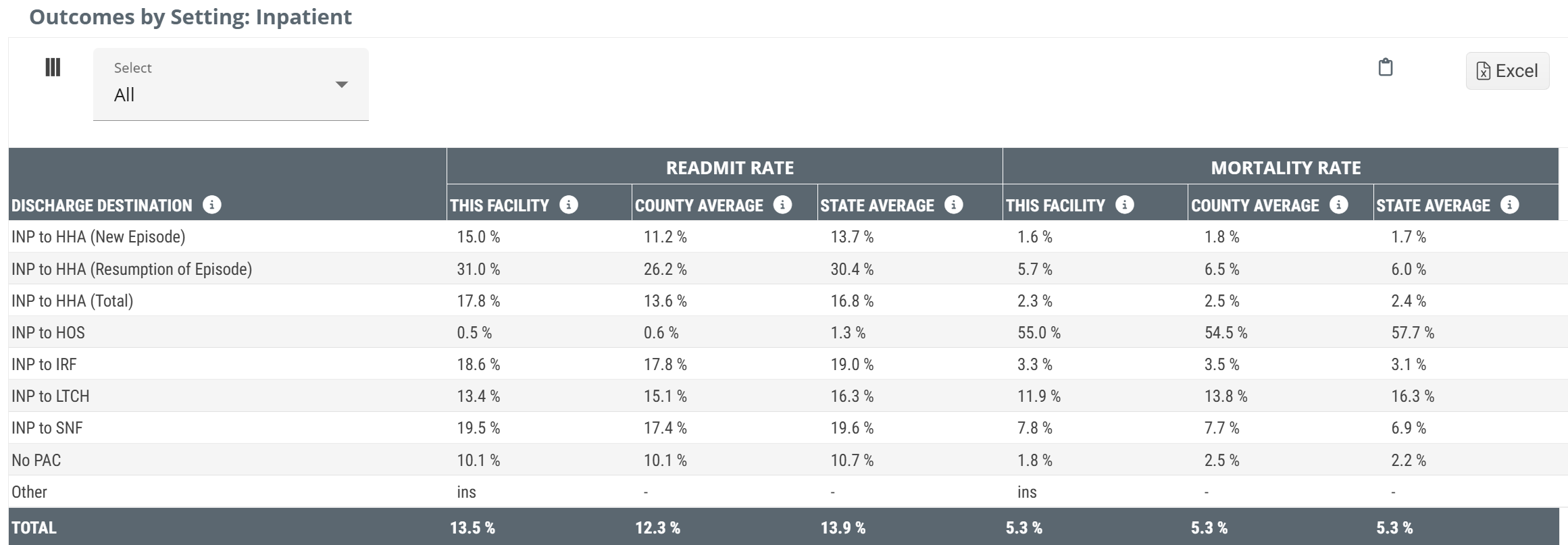
Outcomes by Setting: Inpatient table
This table is the flip side of the table, Discharge Events by Setting. That table answers the question, "After Discharge, where'd everybody go?" This table answers the question, "What happened when they got there."
This action-packed table provides several insights into the post-acute care provided to patients discharged from the selected facility. Readmit rates and mortality rates are calculated for several different post-acute destinations with county and state averages available as benchmarks for comparison.
The Outcomes by Setting table will only have an Inpatient version for selected hospitals and a SNF version for selected Skilled Nursing Facilities. The image below is for a hospital. For a selected SNF, the table will be identified by "SNF," instead of "Inpatient," or "INP."
Data Presentation
|
Off
|
 |
|
|
On
|
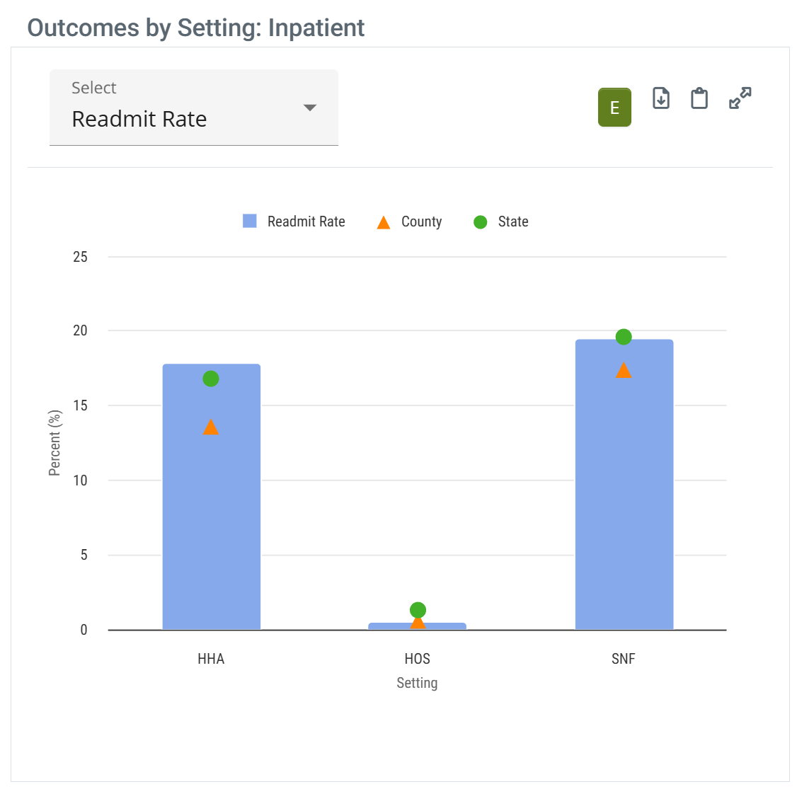 |
When you hover over a bar in the Outcomes by Setting: Inpatient chart, the metrics for the data points on the bars are displayed. (image below) |
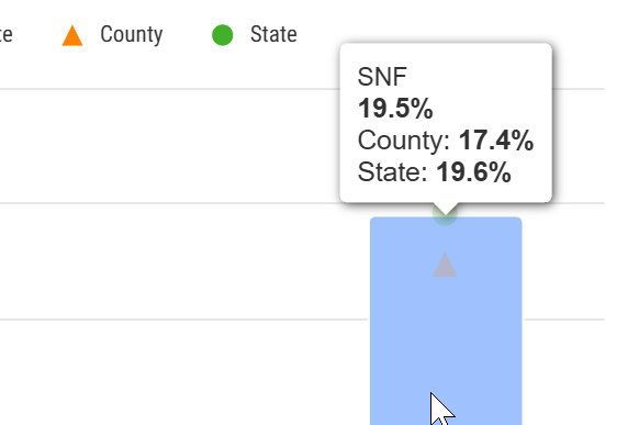 | ||
![]() To enlarge an image, click on it.
To enlarge an image, click on it.
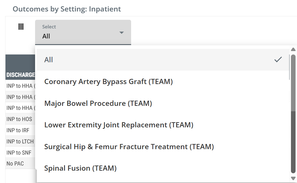
TEAM Insights
|
The dropdown at the top left of the table allows you to choose one of the five TEAM Episode categories. Selecting a specific category will limit the metrics in the Outcomes by Setting: Inpatient table to discharges from the selected hospital that align with the chosen episode category. Click on a single option from the dropdown list. |
 |
Metric Summaries
- Inpatient - Think of this as Patient Pathway. In this column we identify which post-acute destination the inpatient discharges were admitted to.
![]() Example: INP to HOS indicates that the metrics in this row pertain to patients who were discharged from inpatient care and were admitted to hospice care.
Example: INP to HOS indicates that the metrics in this row pertain to patients who were discharged from inpatient care and were admitted to hospice care.
-
Readmit Rate - This is the percentage of discharges from the selected facility who were admitted to the type of post-acute care listed that were readmitted to a hospital within 30 days of the initial discharge. Another way of looking at this is that this is the readmission rate for the selected facility calculated from the subset of patients who entered the listed post-acute care setting.
- State and county benchmarks are included for comparison.
![]() For more information on Readmission rates, see Readmission Rates.
For more information on Readmission rates, see Readmission Rates.
- Mortality Rate - This is the rate at which patients expired within 30 days of discharge from this facility following admission to the type of post-acute care listed.
![]() For more information on the category, "other," see Facilities Analyze page - What is "Other?"
For more information on the category, "other," see Facilities Analyze page - What is "Other?"
![]() The content on this table is intended to be introductory - for usage information and more detail, see Outcomes by Setting.
The content on this table is intended to be introductory - for usage information and more detail, see Outcomes by Setting.
|
|
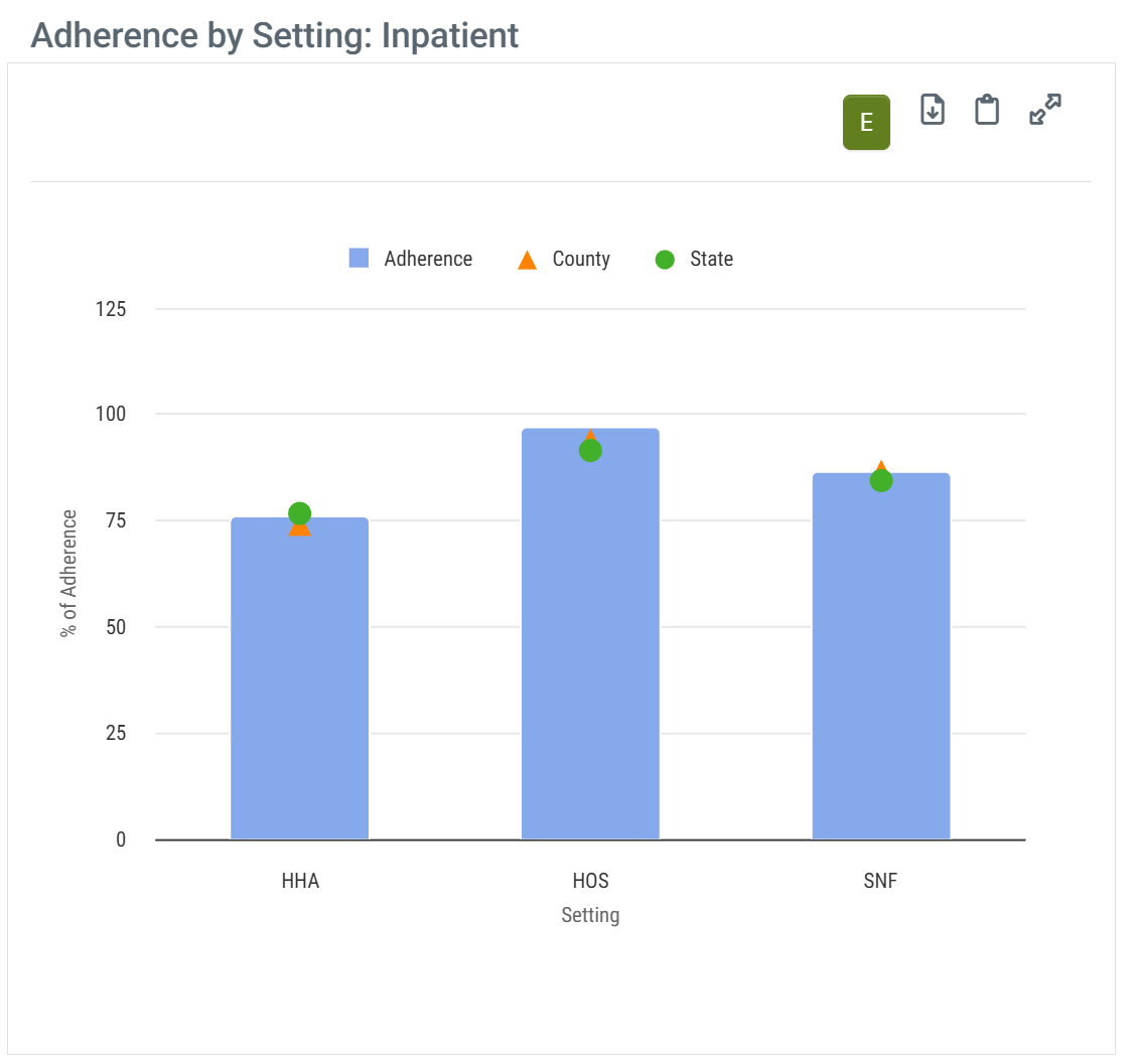
Adherence by Setting chart
This chart shows the adherence percentages for discharges from the selected facility for patients coded for home health, hospice, and skilled nursing. The stage and county averages for each care type is shown as a triangle and circle.
![]() Adherence is the percentage of distinct discharges coded for a specific post-acute type of care who were admitted to the type of care for each bar in the chart within 30 days of discharge from the selected facility during the one-year reporting period.
Adherence is the percentage of distinct discharges coded for a specific post-acute type of care who were admitted to the type of care for each bar in the chart within 30 days of discharge from the selected facility during the one-year reporting period.
Data Presentation
| The Adherence by Setting: Inpatient is only visible with Chart View on -
| |
| Full Chart View | Hover |
 |
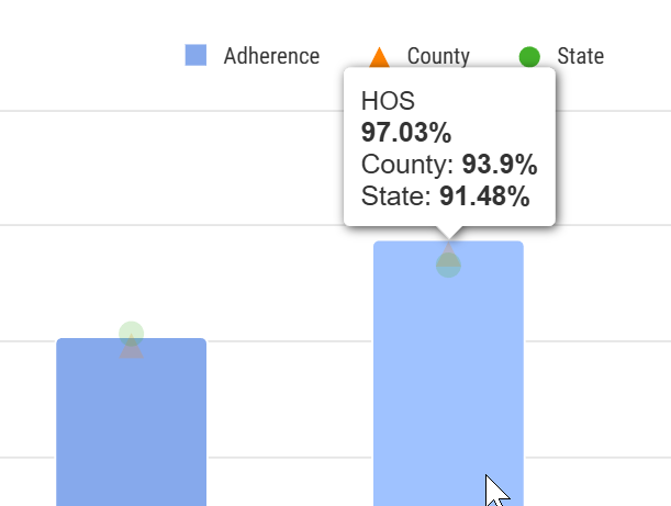
When you hover over a bar in the Adherence by Setting: Inpatient chart, the metrics for the data points on the bars are displayed. (image below) |
 | |
Metric Summaries
|
Source: The metrics shown in the Adherence by Setting: Inpatient chart can be found in the Discharge Events by Setting table under the Adherence Rate column. The state and county metrics are unique to this chart. |
 |
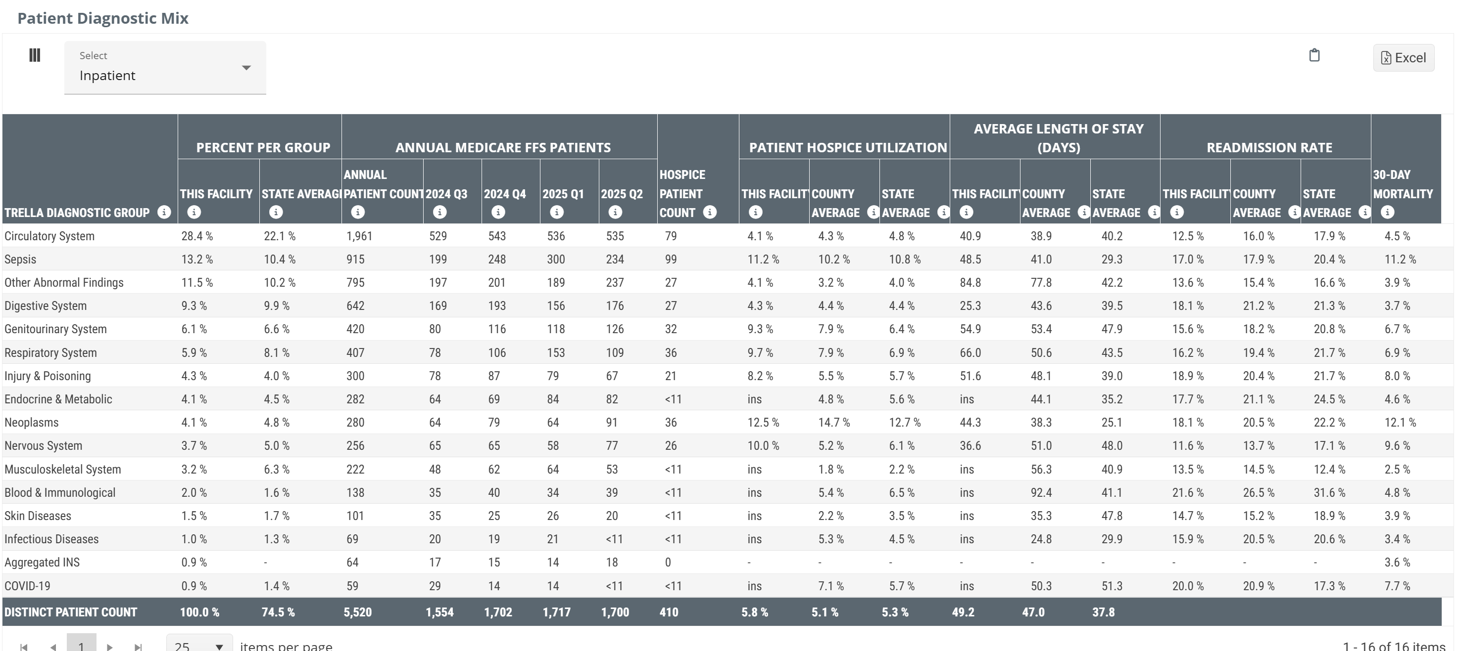
Patient Diagnostic Mix table
This table breaks out several key metrics by the Trella Health Diagnostic Categories. This will allow you to zoom in on areas of strength based on more narrow patient populations.
Data Presentation
|
Off
|
 |
|
On
|
There is no chart view for the metrics in this table. The table above is shown with Chart View on. |
![]() To enlarge an image, click on it.
To enlarge an image, click on it.
Metric Summary
The following list includes summaries of each section. Please go to the full article for more details and links.
![]() All state and county benchmarks are calculated from claims submitted by similar facilities in the same state or county as the selected facility.
All state and county benchmarks are calculated from claims submitted by similar facilities in the same state or county as the selected facility.
- Trella Diagnostic Group - This column identifies the Trella Health diagnostic Group for the metrics in each row
- Percent per Group - This metric is the percent of the selected facility's Medicare patients who had a primary diagnosis code included in the diagnostic category in each row
- Annual Medicare FFS Patients - This is the count of the selected facility's Medicare patients who had a primary diagnosis code included in the listed diagnostic category in each row during the one-year reporting period. The quarterly metrics are calculated from the quarter listed as the reporting period
- Hospice Patient Count - This count is a subset of Annual Medicare FFS Patients - Annual Patient Count. It is the count of the selected facility's Medicare patients who had a primary diagnosis code included in the listed diagnostic category in each row and who were admitted to hospice care within 30 days of discharge
- Patient Hospice Utilization - This metric is the percentage of the selected facility's "Total" Medicare patients who had a primary diagnosis code included in the listed diagnostic category and were admitted to home health within 30 days of discharge
- Average Length of Stay (Days) - This metric is the average length of stay (in days) in hospice care for patients who had a primary diagnosis code included in the listed diagnostic category and who were admitted to hospice care within 30 days of discharge from the selected facility
- Readmission Rate - This is the percentage of patients who had a primary diagnosis code included in the listed diagnostic category who were readmitted to a hospital within 30 days of the initial discharge from the selected facility
- 30 Day Mortality - This metric is the rate at which patients discharged from the selected facility expired within 30 days of discharge
Aggregated INS
There is an entry titled, “Aggregated INS” which represents the combined percentage for all diagnostic groupings that are too small to be presented on their own. In any case where the total number of patients in a specific diagnostic grouping drops below 11 patients, we can't show that number for privacy reasons. We roll all diagnostic groupings that represent counts <11 into this one category and present that count with this header. In sum, this row includes all diagnostic groupings that have insufficient counts aggregated into a single metric.
Inpatient/Outpatient
| The dropdown at the top left of the table will allow you to change whether the table reflects inpatient or outpatient claims. | 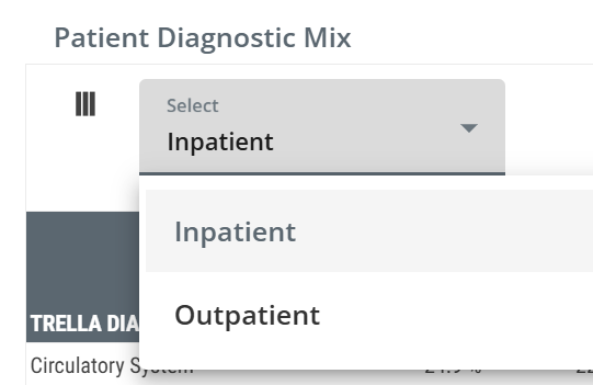 |
|
|
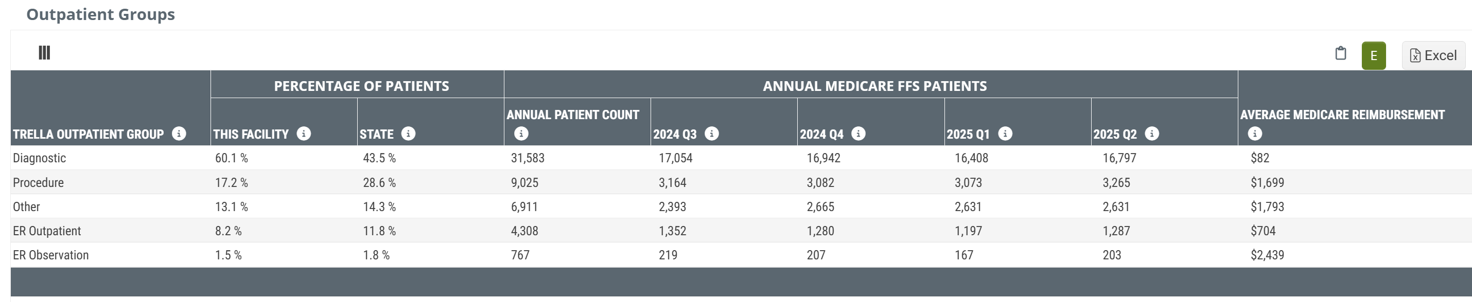
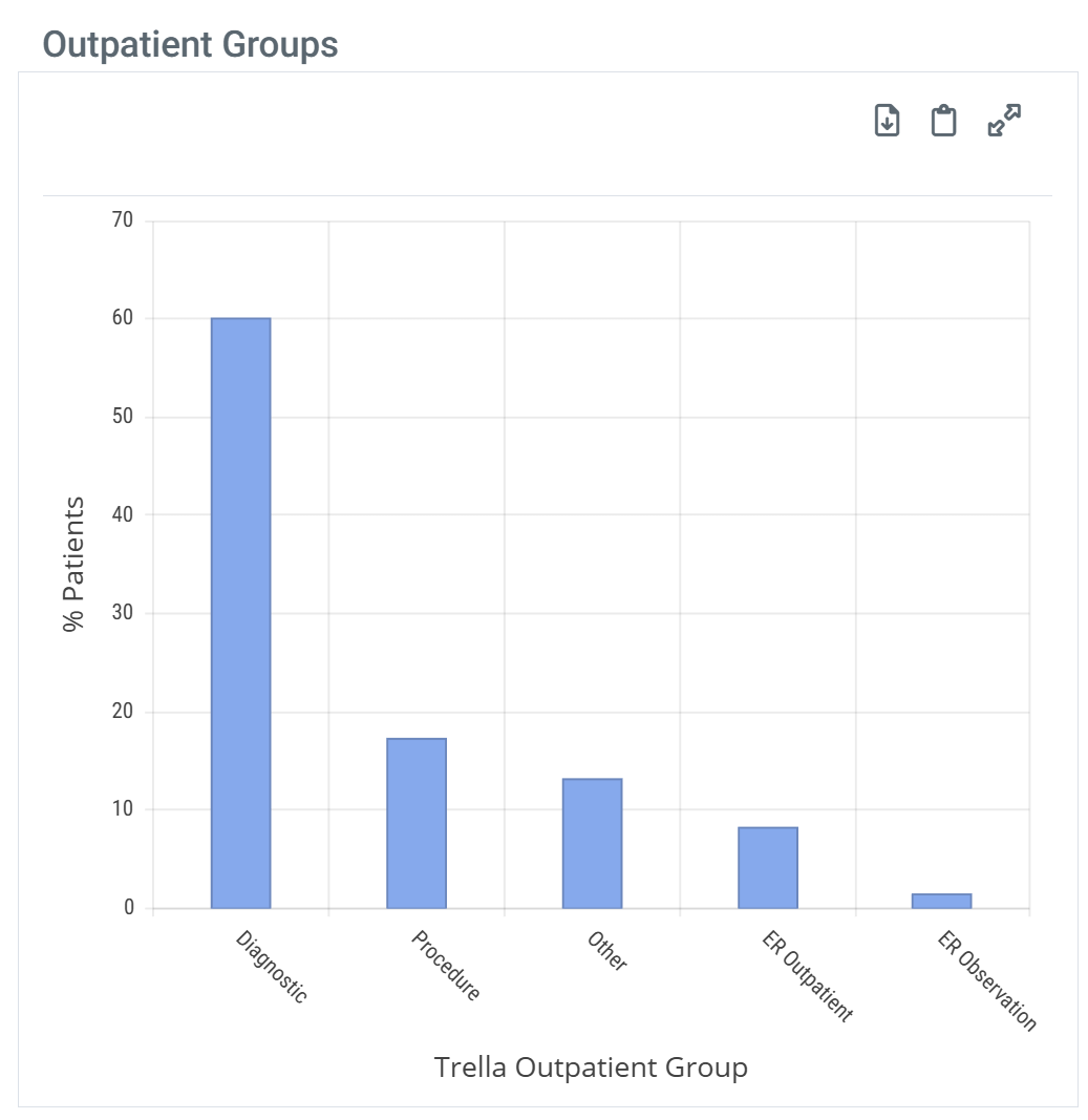
Outpatient Groups table
The Outpatient Groups table includes some basic metrics that will help you to understand the patient population as compiled from outpatient metrics submitted by the selected facility.
Data Presentation
|
Off
|
 |
|
|
On
|
 |
When you hover over a bar in the Outcomes by Setting: Inpatient chart, the metrics for the data points on the bar are displayed. (image below) |
| ||
![]() To enlarge an image, click on it.
To enlarge an image, click on it.
Metric Summary
- Trella Outpatient Group - this row header identifies the Trella Outpatient Group assigned to the procedure (HCPCS) code listed on the outpatient claim. The metrics in the row align with the listed Outpatient Group.
- Percentage of Patients - this metric is the percentage of patients treated by the facility with an outpatient procedure code that was assigned to the listed Trella Outpatient Group. The state average for all matching facilities in the state is provided for comparison.
- Annual Medicare FFS Patients - the count of distinct Medicare FFS patients discharged from the selected facility with an outpatient procedure code that was assigned to the listed Trella Outpatient Group. The table includes a count from the most recent year available and counts for each quarter in that year to show any recent trends in patient counts.
- Average Medicare Reimbursement - the dollar amount is the average Medicare reimbursement for all outpatient visits assigned to the listed Trella Outpatient Group.
|
|
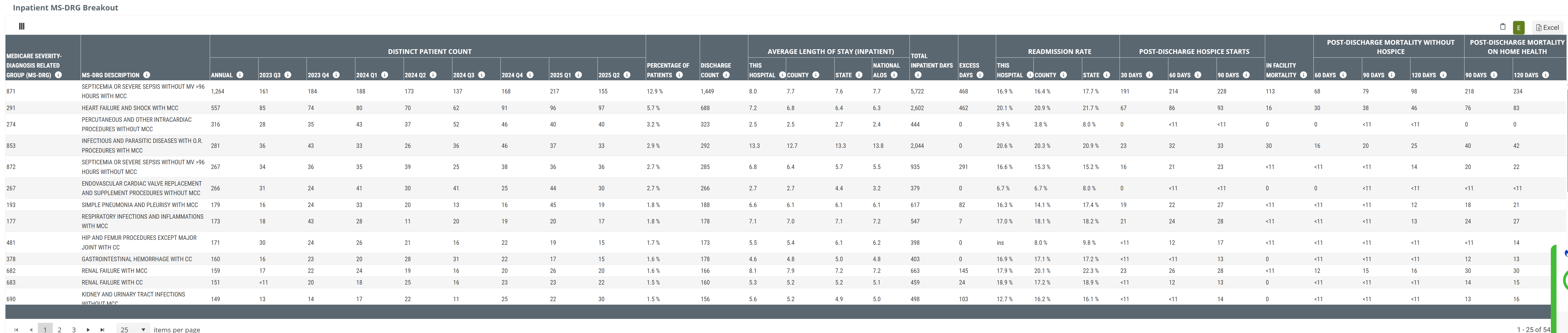
Inpatient MS-DRG Breakout table
This table contains counts and percentage of patients discharged from the selected facility broken out by Diagnostic Related Group (DRG). For each DRG we have included patient metrics, length of stay metrics, and readmission rates.
![]() This highly detailed view of patient diagnoses provides insights into areas of specialization where you might be able to develop a partnership with a specific hospital. Start by knowing which DRGs represent diagnoses for which your care is excellent. Then evaluate the selected hospital of interest to see if that DRG represents an area of need.
This highly detailed view of patient diagnoses provides insights into areas of specialization where you might be able to develop a partnership with a specific hospital. Start by knowing which DRGs represent diagnoses for which your care is excellent. Then evaluate the selected hospital of interest to see if that DRG represents an area of need.
Data Presentation
|
Off
|
 |
|
On
|
There is no chart view for the metrics in this table. The table above is shown with Chart View on. |
![]() To enlarge an image, click on it.
To enlarge an image, click on it.
![]() The Average Length of Stay metrics are for the inpatient stay. For any DRG where you excel, look for an ALOS longer than the state average. Building a trust relationship with a hospital in that situation may allow you to help by getting patients into post-acute care faster if they know you will provide excellent care for their patients. This will help the hospital to lower their inpatient ALOS.
The Average Length of Stay metrics are for the inpatient stay. For any DRG where you excel, look for an ALOS longer than the state average. Building a trust relationship with a hospital in that situation may allow you to help by getting patients into post-acute care faster if they know you will provide excellent care for their patients. This will help the hospital to lower their inpatient ALOS.
Metric Summary
Metric/Column |
Description |
|
| Medicare Severity - Diagnostic Related Group (MS-DRG) | This column shows the MS-DRG code for the Diagnosis Related Group (DRG) listed on the inpatient claim. | |
| MS-DRG Description | This is the description of the DRG listed on the inpatient claim. | |
|
Distinct Patient Count Annual/20YY-Q# |
The count of distinct patients discharged with the DRG listed on an inpatient claim during the time period identified in the header. Annual is a count for the most recent year. | |
| Percentage of Patients | The percentage of patients discharged from the selected facility that had the listed DRG on an inpatient claim during the two-year reporting period. | |
| Discharge Count | The count of stays discharged with the DRG listed on an inpatient claim during the two-year reporting period. | |
| Average Length of Stay | This Hospital | The average length of stay (in days) spent in the selected hospital for patients that had the DRG listed on an inpatient claim during the one-year reporting period. |
| County | For the selected hospital's county, this metric is the average length of stay (in days) for patients who had the DRG listed on an inpatient claim during the one-year reporting period. | |
| State | For the selected hospital's state: The average length of stay (in days) for patients who had the DRG listed on an inpatient claim during the one-year reporting period. | |
| National ALOS | The average number of inpatient days for all hospitals nationwide for the same DRG category. | |
| Total Inpatient Days |
The count of all inpatient days for patients discharged from the selected facility who had the DRG listed on the inpatient claim, based on the most recent two years of claims data. |
|
| Excess Days | The number of inpatient days above the state average that a hospital is using for the selected DRG category. This metric is always zero or positive and highlights potential opportunities to reduce length of stay. A higher value indicates that, on average, patients at the hospital remain admitted longer than similar patients across the state. | |
| Readmission Rate | This Hospital | The percentage of patients who had the DRG listed on an inpatient claim during the two-year reporting period and were readmitted to a hospital within 30 days of discharge from the selected facility. |
| County | For the selected hospital's county: The percentage of patients who had the DRG listed on an inpatient claim during the two-year reporting period and were readmitted to a hospital within 30 days of the initial hospital discharge. | |
| State | For the selected hospital's state: This metric is the percentage of patients who had a DRG on an inpatient claim during the two-year reporting period and were readmitted to a hospital within 30 days of the initial hospital discharge. | |
| Post-Discharge Hospice Starts | 30 Days | The number of patients discharged from this hospital with the listed DRG who were admitted to hospice care within 30 days following discharge, based on the most recent two years of claims data. |
| 60 Days | The number of patients discharged from this hospital with the listed DRG who were admitted to hospice care within 60 days following discharge, based on the most recent two years of claims data. | |
| 90 Days | The number of patients discharged from this hospital with the listed DRG who were admitted to hospice care within 90 days following discharge, based on the most recent two years of claims data. | |
| In Facility Mortality | The count of distinct patients discharged with the MS-DRG listed on an inpatient claim with a discharge status code indicating the patient expired at the facility, based on the most recent two years of claims data. | |
| Post-Discharge Mortality Without Hospice | 60 Days | The count of patients discharged from this hospital with the listed DRG who died without hospice within 60 days following this hospitals discharge, based on the most recent two years of claims data. |
| 90 Days | The count of patients discharged from this hospital with the listed DRG who died without hospice within 90 days following this hospitals discharge, based on the most recent two years of claims data. | |
| 120 Days | The count of patients discharged from this hospital with the listed DRG who died without hospice within 120 days following this hospitals discharge, based on the most recent two years of claims data. | |
| Post-Discharge Mortality on Home Health | 90 Days | The count of patients discharged from this hospital with the listed DRG who were admitted to home health and subsequently died while on home health within 90 days of discharge, based on the most recent two years of claims data. |
| 120 Days | The count of patients discharged from this hospital with the listed DRG who were admitted to home health and subsequently died while on home health within 120 days of discharge, based on the most recent two years of claims data. | |
![]() DRG's with less than 11 patients (or DRG's that represent less than 1% of total inpatient stays) are excluded from this table.
DRG's with less than 11 patients (or DRG's that represent less than 1% of total inpatient stays) are excluded from this table.
|
|
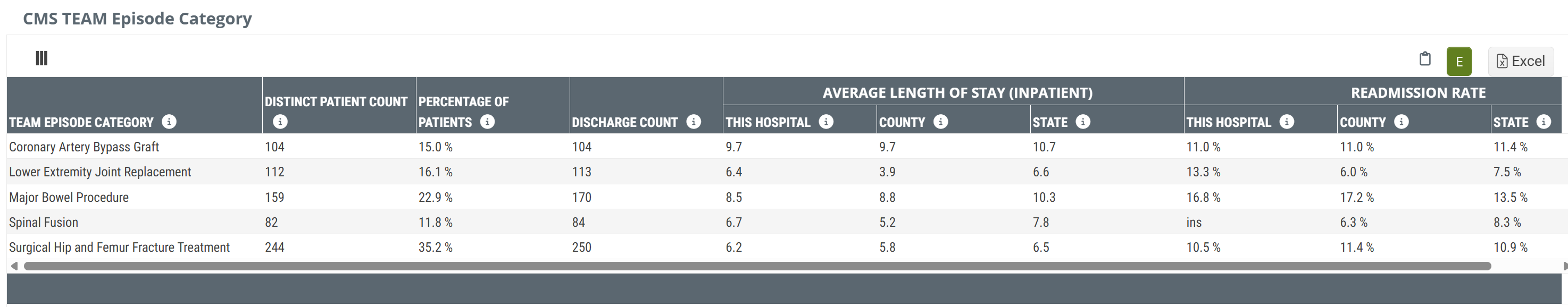
CMS TEAM Episode Category table
The CMS TEAM Episode Category table provides metrics for the selected facility with a focus on the five TEAM episode categories. At a glance, you will be able to determine the volume of patients treated by the selected facility for each of the five TEAM episode categories along with length of stay metrics and readmission rates.
![]() Unlike many of the tables under this tab, the CMS TEAM table will not be shown for skilled nursing facilities.
Unlike many of the tables under this tab, the CMS TEAM table will not be shown for skilled nursing facilities.
Data Presentation
|
Off
|
 |
|
On
|
There is no chart view for the metrics in this table. The table above is shown with Chart View on. |
![]() To enlarge an image, click on it.
To enlarge an image, click on it.
Metric Summary
- TEAM Episode Category - this column shows the Transforming Episode Accountability Model (TEAM) Episode Category for which the metrics in the same row are calculated
- Distinct Patient Count - the metrics in this column are counts of distinct patients discharged with an inpatient MS-DRG associated with the listed TEAM episode category during the two-year reporting period
- Percentage of Patients - the percentage of patients discharged with an inpatient MS-DRG associated with any of the five TEAM episode categories who were discharged with an inpatient MS-DRG associated with the TEAM episode category listed in the row. This metric is calculated for the two-year reporting period
![]() This metric is calculated from all patients discharged from the selected facility with an inpatient MS-DRG that aligns with a TEAM episode category.
This metric is calculated from all patients discharged from the selected facility with an inpatient MS-DRG that aligns with a TEAM episode category.

- Discharge Count - the metrics in this column are the counts of stays discharged with an inpatient MS-DRG associated with the listed TEAM Episode Category during the two-year reporting period. The count of stays can be higher than the count of distinct patients if some patients were discharged from multiple stays within the reporting period.
- Average Length of Stay (Inpatient) - the average length of stay (in days) spent in this hospital for patients discharged with an inpatient MS-DRG associated with the listed TEAM Episode Category during the two-year reporting period. County and state lengths of stay are provided for comparison.
- Readmission Rate - the percentage of patients discharged with an inpatient MS-DRG associated with the listed TEAM Episode Category during the two-year reporting period who were readmitted to a hospital within 30 days of discharge from the selected facility.
|
|
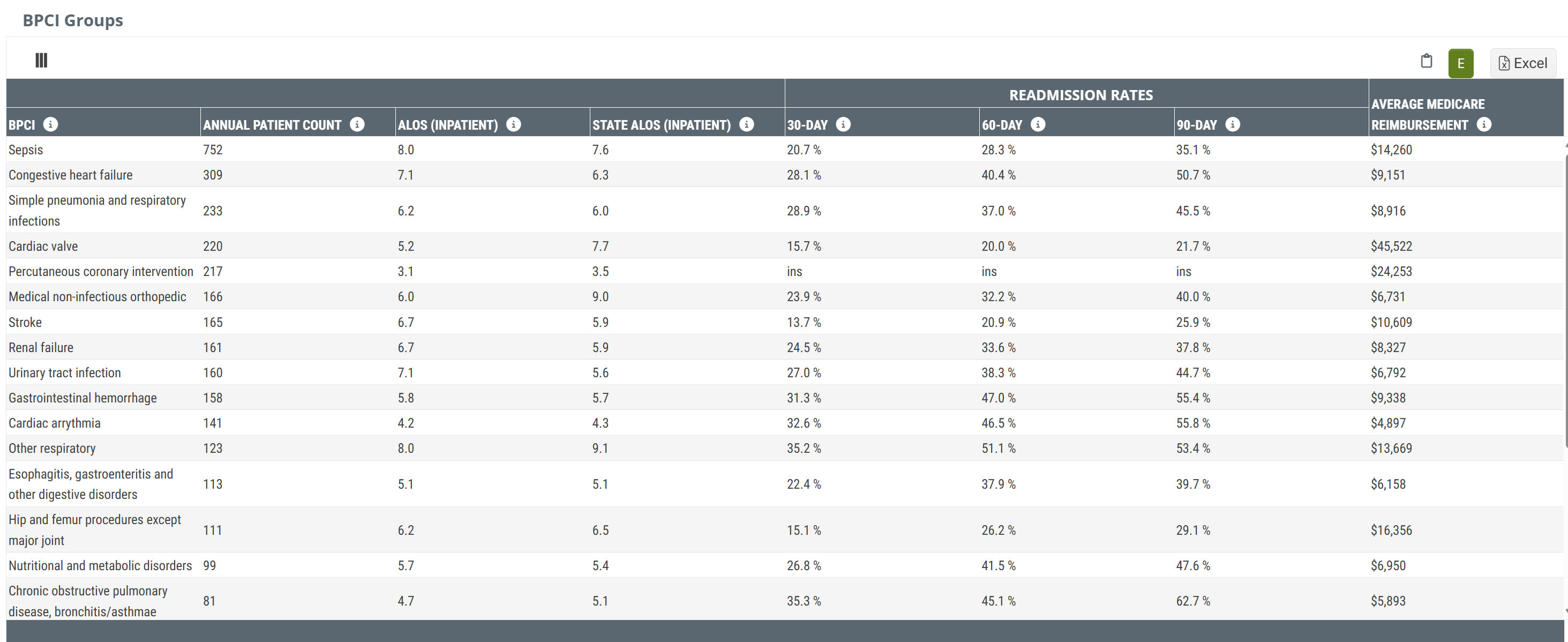
BPCI Groups table
The BPCI Groups table breaks down the selected facility's patients by the bundled payment types and provides metrics for trended readmission rates, average length of stay, readmission rates with state and county comparisons, and average Medicare spend.
Data Presentation
|
Off
|
 |
|
On
|
There is no chart view for the metrics in this table. The table above is shown with Chart View on. |
![]() To enlarge an image, click on it.
To enlarge an image, click on it.
Metrics Summary
- BPCI - the Bundled Payment for Care Improvement (BPCI) category. Metrics in the same row are calculated based on claims for which the diagnosis aligns with the listed BPCI category
- Annual Patient Count - the count of distinct patients admitted to the selected facility during the one-year reporting period with diagnoses that aligned with the listed BPCI category
-
ALOS (Inpatient) - the average length of stay at the selected facility for patients discharged from the facility during the one-year reporting period whose diagnosis aligned with the listed BPCI category
- State ALOS (Inpatient) - the average length of stay at all facilities in the same state as the selected facility for patients discharged during the one-year reporting period whose diagnosis aligned with the listed BPCI category
- Readmission Rates - the readmission rate for patients discharged during the two-year reporting period with a diagnosis that aligned with the listed BPCI category who were readmitted to inpatient care within 30, 60, and 90 days of the initial discharge
- Average Medicare Reimbursement - the average Medicare reimbursement for all inpatient stays that match the listed BPCI category during the two-year reporting period
|
|
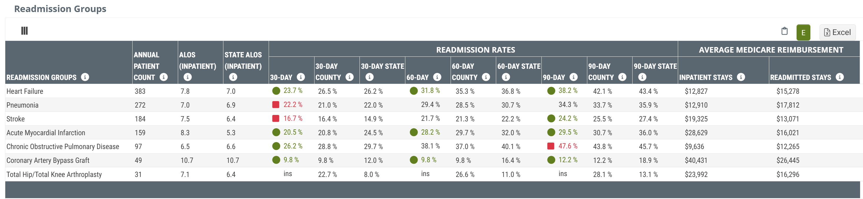
Readmission Groups table
The Readmission Groups table shows patient counts, readmission rates, and Medicare reimbursement for patients admitted to the selected facility broken out by readmission groups.
Data Presentation
|
Off
|
 |
|
On
|
There is no chart view for the metrics in this table. The table above is shown with Chart View on. |
![]() To enlarge an image, click on it.
To enlarge an image, click on it.
Metrics Summary
- Readmission Groups - this column shows the readmission group for each row. Metrics in the same row are calculated from claims where the primary diagnosis aligns with the listed readmission group
- Annual Patient Count - the count of distinct patients admitted to the selected facility during the one-year reporting period whose primary diagnosis aligned with the listed readmission group
-
ALOS (Inpatient) - the average length of stay, in days, for patients discharged from the selected facility during the one-year reporting period whose primary diagnosis aligned with the listed readmission group
- State ALOS (Inpatient) - the average length of stay at all facilities in the same state as the selected facility for patients discharged during the one-year reporting period whose diagnosis aligned with the listed readmission group
-
Readmission Rates - the readmission rate for patients discharged during the two-year reporting period with a diagnosis that aligned with the listed readmission who were readmitted to inpatient care within 30, 60, and 90 days of the initial discharge
- County and State metrics - the matching 30, 60, and 90 day readmission rates for all facilities from the same state as the selected facility for patients discharged who were readmitted to inpatient care within 30, 60, and 90 days. These county and state metrics are included for comparison to the selected facility.
-
Average Medicare Reimbursement - the average Medicare reimbursement for all inpatient stays during the two-year reporting period for patients with diagnoses that align with the listed readmission group
- Readmitted Stays - the average Medicare reimbursement for patients discharged from the selected facility during the two-year reporting period whose diagnoses aligned with the listed readmission group who were readmitted to inpatient care within 30 days of discharge.
|
|