Overview
The State and County Trends report includes two tables that include a massive spread of detailed market and demographic metrics. All of the metrics are described below, but here are the basics:
- Patient counts based on patient residency at the state and county level
- Counts for Medicare FFS and Medicare Advantage
- Patient counts by ethnicity
- Patient counts by gender and age
- Patient counts and aggregate costs of care specific to hospice
- Annual trends for the last eight years (most recent year is year-to-date.)
- Quarterly trends for the last eight quarters
 Location
Use these steps to open the State & County Trends tab to see the reports.
| Click on the "Reports" button in the left navigation to open the Reports page. |  |
- Then, click on the State & County Trend tab.

There are two reports under the State & County Trends tab.
 In this article
Quick Value
![]() The two tables include detailed metrics at the state and county level. Evaluating these metrics will help you to understand geographic patient trends that shape market demand. Use the metrics to understand where patients are in the selected region and how care is being delivered to those patients. Understanding trends from the two tables enables better strategic planning, market assessment, and informs operational decision
The two tables include detailed metrics at the state and county level. Evaluating these metrics will help you to understand geographic patient trends that shape market demand. Use the metrics to understand where patients are in the selected region and how care is being delivered to those patients. Understanding trends from the two tables enables better strategic planning, market assessment, and informs operational decision
 Tables show where hospice patients live
Reveals county-level patient distribution to help teams prioritize the highest-need and highest-potential markets.
 Metrics highlight demographics by county
Provides visibility into how patient needs differ across counties, supporting targeted outreach and care program alignment.
 Tables reveal utilization & competitive shifts
Tracks market changes, and penetration trends — equipping leaders with actionable intelligence for growth planning.
 Analytics inform strategic territory design
Helps organizations align reps, resources, and expansion strategies with true market demand to strengthen coverage and performance.
Filters and features
![]() A few settings are needed before you can examine the metrics in the tables. There are also a couple helpful features to keep in mind. These are listed below.
A few settings are needed before you can examine the metrics in the tables. There are also a couple helpful features to keep in mind. These are listed below.
State and County Selection
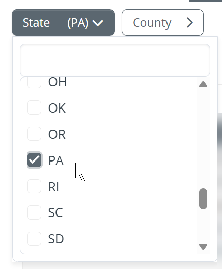
| There are two filters selectors at the top left of the page. These allow you to select the state and county for the metrics you want to view on the page. | 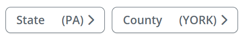 |
The selections will open
The State Trends table will display metrics for the state you choose
|
 |
|
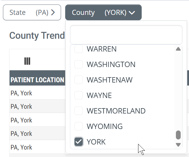
Once you have chosen a state in the State filter selector, you have the option of choosing a county in the selected state. This can work one of two ways.
|
 |
|
| |
Pages of metrics
If you are brave and ambitious and choose to view all counties in your selected state, you will be faced with a LOT of rows of metrics. The navigation tools at the bottom of the table will help you to navigate through the pages.

![]()
The table, for one location, has more than 40 metrics. The default for the "items per page" dropdown is 25 rows. This means that you will not see all available metrics for a single location when you scroll down.
![]() Set the dropdown to 50 items per page so that all metrics for a single location are displayed on the page. You will still need to scroll down to see those metrics since the window can only show a dozen rows at a time.
Set the dropdown to 50 items per page so that all metrics for a single location are displayed on the page. You will still need to scroll down to see those metrics since the window can only show a dozen rows at a time.
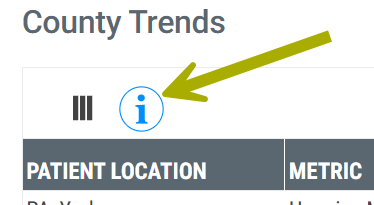
The Big Blue "i" Button
|
The "i" button in the circle at the top left of the page is a dropdown that displays definitions for all of the metrics in both tables.
|
 |
Remembering Excel
Finally, and especially if you are looking at all of the counties in your chosen state, if you click on the ![]() button at the top right of the table, you can download the metrics in the table to an Excel spreadsheet. That way, you can organize and view the metrics the way you want.
button at the top right of the table, you can download the metrics in the table to an Excel spreadsheet. That way, you can organize and view the metrics the way you want.
Now, let's look at the tables.
How to use this page
When you first look at this page, at either of the tables, the splash of metrics might be overwhelming. Use the following tips and suggestions to breakdown the table into greater usefulness.
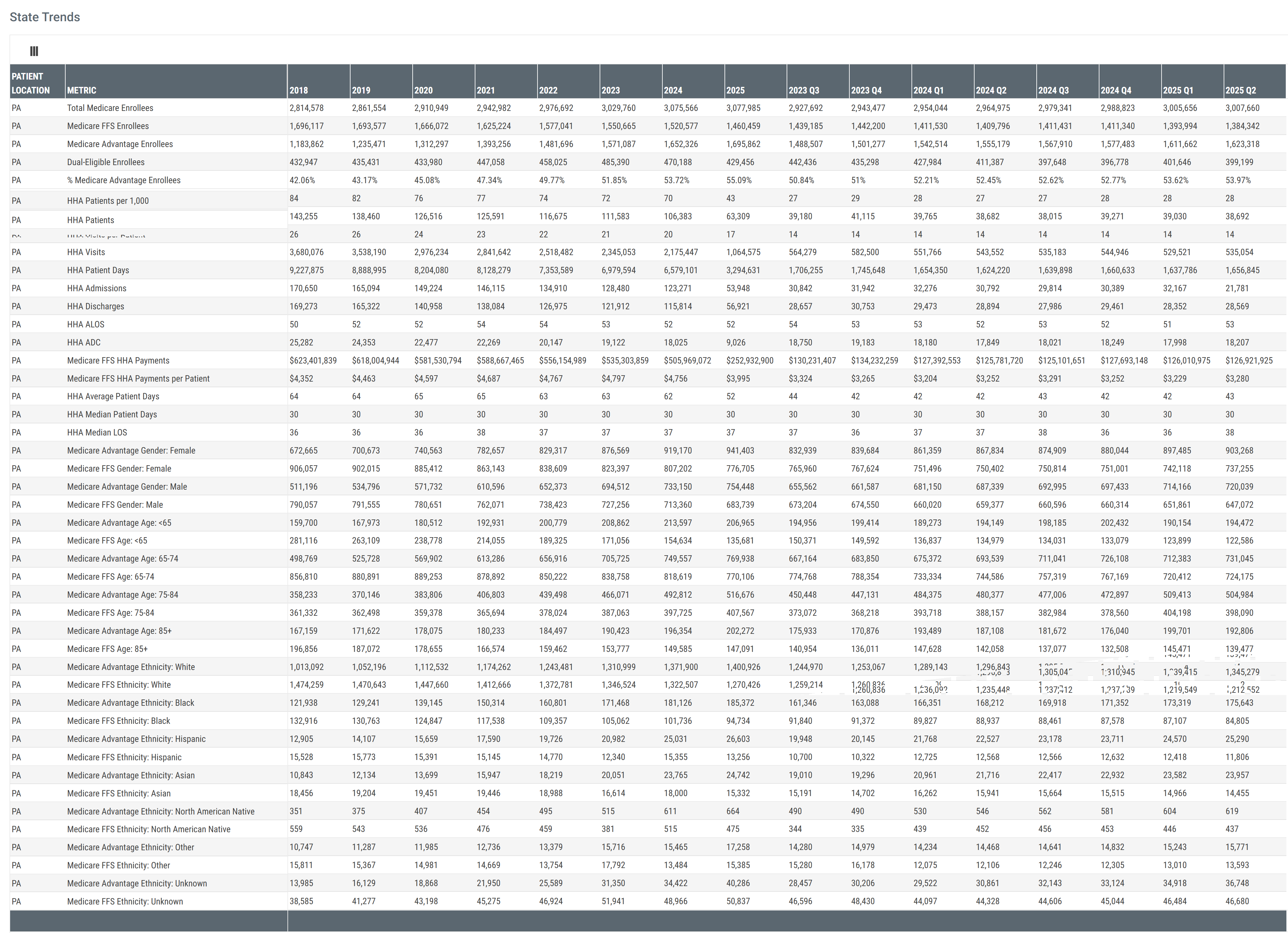
Table Summary
There are four categories of metrics (rows) that are presented as trends over eight years and eight quarters (columns). Keep these larger categories in mind.
- General Medicare Advantage and Medicare FFS patient enrollee counts
- Patient counts by age and gender
- Patient counts by Ethnicity
- Metrics specific to hospice care
![]() A color coded version of these categories can be found under the section for each table.
A color coded version of these categories can be found under the section for each table.
 To keep in mind
- Four categories of metrics
- Trended metrics over two different periods - eight years and eight quarters
- Metrics pertain to residents who resided in the chosen region
Suggestions
Metrics tell a story about what happened. They also answer questions. The goal is to ask the right questions and the right types of questions. Some of these questions will be broad in order to provide the backdrop to understanding the big picture. Other questions need to be precise and targeted. Targeted questions tend to seek to draw a connection between the metrics are what you are trying to accomplish.
- Look for the big trends
- Are enrollee counts going up or going down? Is one row of metrics going up while another is going down? Hmm... why? Is there a sharp increase or decrease? What could be the reason? Are there seasonal trends?
- The demographic and hospice specific metrics could also show trends over time.
-
Demographic questions
- Which demographic is dominating the selected territory? What is the mix of age or ethnicity in the selected territory? Is your organization properly aligned to serve those patient populations? Is there evidence of a demographic shift that your organization will need to respond to?
- Anomalies? Are there metrics that stand out as too high, or too low? What else do we need to know to understand metrics that stand out in this way? For the most part, when a metric stands out in this way, finding the reason provides the greatest insights into what is going on with patients in a specific territory
![]() When you find anything in Trella Health's metrics that seem odd or askew, get in touch with your CSM. It is a goal to dig in on mysteries and make sense of them.
When you find anything in Trella Health's metrics that seem odd or askew, get in touch with your CSM. It is a goal to dig in on mysteries and make sense of them.
-
Opportunities!
- Look for metrics or trends that align with your organization's strengths and ongoing initiatives. Are there specific sectors in a patient population that is growing but is underserved?
- Look for metrics that connect patient needs to your strengths.
- Compare counties for patterns and trends that suggest strategic changes, or that suggest a change in allocation of resources.
![]() Comparing different counties would be easiest by exporting the table to Excel. This is especially true if your territory serves adjacent counties in different states. You might need to combine multiple Excel exports into a single file.
Comparing different counties would be easiest by exporting the table to Excel. This is especially true if your territory serves adjacent counties in different states. You might need to combine multiple Excel exports into a single file.
-
Hospice specific metrics
- The State & County Trends tab includes a score of metrics specific to patients who received hospice care in the selected territory.
- All of the questions and types of questions suggested above can be reconsidered with specific focus on the hospice patient population.
- These metrics allow you to closely align trends to your agency.
 Connections
The metrics under the State & County Trends tab are very general. The picture painted from these metrics is the background against which you can view every other insight provided in Trella Insights for Hospice. Once you have set the scene under the State & County Trends tab, there are many tools that can complete the picture.
- On the Reports page, the Market Share tab can show the hospices that serve in your selected territory.
- On the Explore page, you can set the filters to the same territory and then evaluate and compare providers that serve the patients in the bigger picture.
- For significant provider of interest, open the Analyze page to do a detailed assessment
- If you use Trella CRM, which is a great idea, you can peruse your most active accounts and contacts in the same territory to make immediate tactical decisions based on the detailed context from the State & County Trends tab. Or dig in to your EHR for a similar assessment.
This only scratches the surface. If you want more ideas, make contact with you customer success manager, or send a question to Support@TrellaHealth.com
County Trends table
The image below shows a sample of the metrics for a single county, York, PA. (Identified in the first column in the box.)
![]() Click on the image to expand it.
Click on the image to expand it.
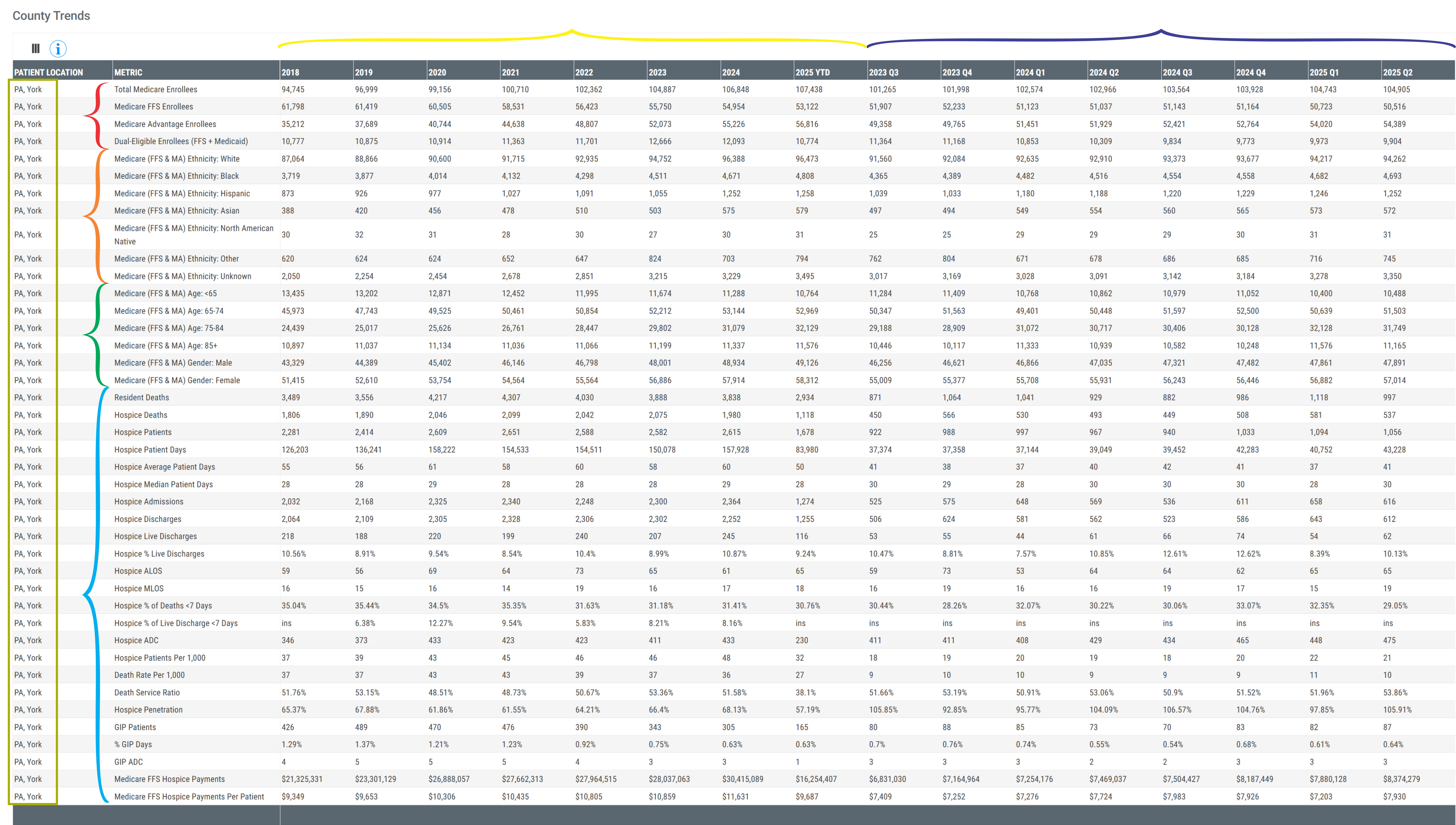
Categories
There are some general categories of content in the table that are identified in the image above.
Color Coding |
Description |
| Red | Rows - counts of Medicare Advantage and Medicare FFS enrollee |
| Orange | Rows - patient ethnicity breakdown |
| Green | Rows - patient gender and age demographics |
| Cyan | Rows - hospice specific metrics |
| Yellow | Columns - annual metrics for the last eight years |
| Dark Blue | Columns - quarterly metrics for the most recent 8 quarters |
Understanding the Metrics
| Total Medicare Enrollees | The count of distinct beneficiaries enrolled in Medicare (Fee-for-Service or Medicare Advantage) at any point during the period listed in the column header. |
| Medicare FFS Enrollees | The count of distinct beneficiaries enrolled in a Medicare Fee-for-Service plan for at least one month during the period listed in the column header. |
| Medicare Advantage Enrollees | The count of distinct beneficiaries enrolled in a Medicare Advantage plan for at least one month during the period listed in the column header. |
| Dual-Eligible Enrollees (FFS + Medicaid) | The count of distinct Medicare beneficiaries eligible for Medicaid coverage at any point during the period listed in the column header. |
| Ethnicity | The counts of enrollees broken out by the listed ethnicity for Medicare FFS and Medicare Advantage patients during the period listed in the column header |
| Gender and Age | The counts of enrollees broken out by the listed gender or age for Medicare FFS and Medicare Advantage patients during the period listed in the column header |
| Resident Deaths | The count of deaths among residents during the period listed in the column header. |
| Hospice Deaths | The count of deaths that occurred while the patient was enrolled in hospice during the period listed in the header. |
| Hospice Patients | The count of distinct count of patients enrolled in hospice at any point during the period listed in the column header. |
| Hospice Patient Days | The count of days patients were enrolled in hospice during the period listed in the column header. |
| Hospice Average Patient Days | The average number of hospice days per enrolled patient for the period listed in the column header. |
| Hospice Median Patient Days | Median number of hospice days per enrolled patient period listed in the column header. |
| Hospice Admissions | Total number of new hospice enrollments during the period listed in the column header. |
| Hospice Discharges | Total number of hospice discharges during the period listed in the column header. |
| Hospice Live Discharges | Number of hospice discharges during the period listed in the column header where the patient did not expire. |
| Hospice % Live Discharges | Percentage of hospice discharges who were live discharges for the period listed in the column header. |
| Hospice ALOS | Average hospice length of stay (in days) for discharged patients during the period listed in the column header. |
| Hospice MLOS | Median hospice length of stay (in days) for discharged patients during the period listed in the column header. |
| Hospice % of Deaths < 7 Days | |
| Hospice % of Live Discharge < 7 Days | |
| Hospice ADC | The average daily number of patients enrolled in hospice during the period listed in the column header. |
| Hospice Patients per 1,000 |
The number of hospice patients per 1,000 Medicare enrollees. (FFS only) - A "per thousand" metric provides a way to compare performance in the same row by leveling population metrics that could be very different.
|
| Death Rate per 1,000 |
The number of deaths per 1,000 Medicare enrollees. (FFS only) - A "per thousand" metric provides a way to compare performance in the same row by leveling population metrics that could be very different.
|
|
Death Service Ratio (percentage) |
This is the percentage of resident death who died while on hospice
|
| Hospice Penetration |
The percentage of residents who died who were admitted to hospice care.
|
| GIP Patients | The number of hospice patients who received general inpatient (GIP) care during the period listed in the column header. |
| % GIP Days | The percentage of total hospice days that were provided at the GIP level of care during the period listed in the column header. |
| GIP ADC | Average daily number of patients receiving GIP hospice care during the period listed in the column header. |
| Medicare FFS Hospice Payments | Total Medicare Fee-for-Service reimbursement for hospice services during the period listed in the column header. |
| Medicare FFS Hospice Payments per Patient | Average Medicare Fee-for-Service reimbursement per hospice patient during the period listed in the column header. |
State Trends table
The image below shows a sample of the metrics for a single state, PA.
![]() Click on the image to expand it.
Click on the image to expand it.
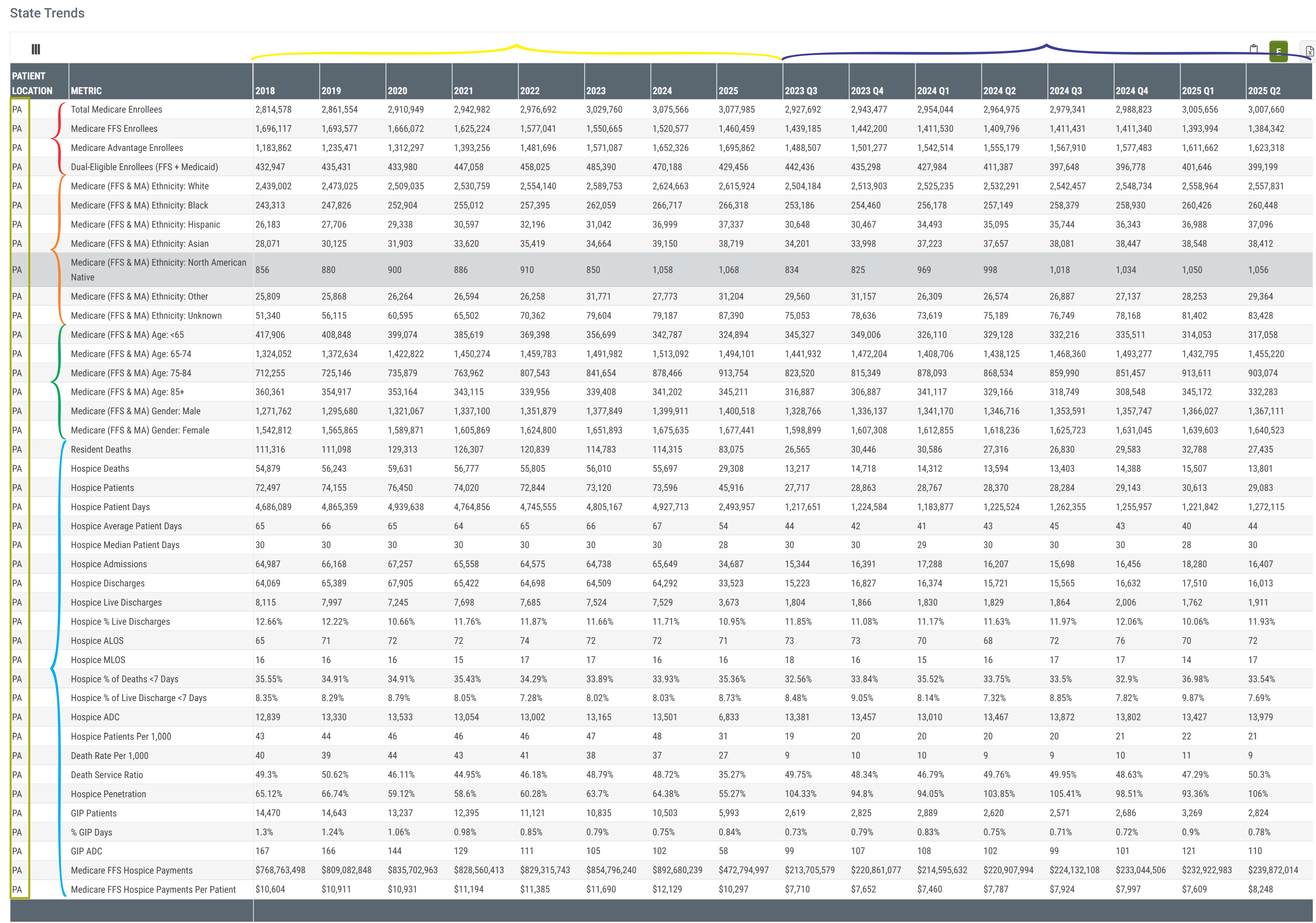
Categories
There are some general categories of content in the table that are identified in the image above.
Color Coding |
Description |
| Red | Rows - counts of Medicare Advantage and Medicare FFS enrollees |
| Orange | Rows - patient ethnicity demographics |
| Green | Rows - patient age and gender demographics |
| Cyan | Rows - hospice specific metrics |
| Yellow | Columns - annual metrics for the last eight years |
| Dark Blue | Columns - quarterly metrics for the most recent 8 quarters |
Understanding the Metrics
| Total Medicare Enrollees | The count of distinct beneficiaries enrolled in Medicare (Fee-for-Service or Medicare Advantage) at any point during the period listed in the column header. |
| Medicare FFS Enrollees | The count of distinct beneficiaries enrolled in a Medicare Fee-for-Service plan for at least one month during the period listed in the column header. |
| Medicare Advantage Enrollees | The count of distinct beneficiaries enrolled in a Medicare Advantage plan for at least one month during the period listed in the column header. |
| Dual-Eligible Enrollees (FFS + Medicaid) | The count of distinct Medicare beneficiaries eligible for Medicaid coverage at any point during the period listed in the column header. |
| Ethnicity | The counts of enrollees broken out by the listed ethnicity for Medicare FFS and Medicare Advantage patients during the period listed in the column header |
| Gender and Age | The counts of enrollees broken out by the listed gender or age for Medicare FFS and Medicare Advantage patients during the period listed in the column header |
| Resident Deaths | The count of deaths among residents during the period listed in the column header. |
| Hospice Deaths | The count of deaths that occurred while the patient was enrolled in hospice during the period listed in the header. |
| Hospice Patients | The count of distinct count of patients enrolled in hospice at any point during the period listed in the column header. |
| Hospice Patient Days | The count of days patients were enrolled in hospice during the period listed in the column header. |
| Hospice Average Patient Days | The average number of hospice days per enrolled patient for the period listed in the column header. |
| Hospice Median Patient Days | Median number of hospice days per enrolled patient period listed in the column header. |
| Hospice Admissions | Total number of new hospice enrollments during the period listed in the column header. |
| Hospice Discharges | Total number of hospice discharges during the period listed in the column header. |
| Hospice Live Discharges | Number of hospice discharges during the period listed in the column header where the patient did not expire. |
| Hospice % Live Discharges | Percentage of hospice discharges who were live discharges for the period listed in the column header. |
| Hospice ALOS | Average hospice length of stay (in days) for discharged patients during the period listed in the column header. |
| Hospice MLOS | Median hospice length of stay (in days) for discharged patients during the period listed in the column header. |
| Hospice % of Deaths < 7 Days | |
| Hospice % of Live Discharge < 7 Days | |
| Hospice ADC | The average daily number of patients enrolled in hospice during the period listed in the column header. |
| Hospice Patients per 1,000 |
The number of hospice patients per 1,000 Medicare enrollees. (FFS only) - A "per thousand" metric provides a way to compare performance in the same row by leveling population metrics that could be very different.
|
| Death Rate per 1,000 |
The number of deaths per 1,000 Medicare enrollees. (FFS only) - A "per thousand" metric provides a way to compare performance in the same row by leveling population metrics that could be very different.
|
|
Death Service Ratio (percentage) |
This is the percentage of resident death who died while on hospice
|
| Hospice Penetration |
The percentage of residents who died who were admitted to hospice care.
|
| GIP Patients | The number of hospice patients who received general inpatient (GIP) care during the period listed in the column header. |
| % GIP Days | The percentage of total hospice days that were provided at the GIP level of care during the period listed in the column header. |
| GIP ADC | Average daily number of patients receiving GIP hospice care during the period listed in the column header. |
| Medicare FFS Hospice Payments | Total Medicare Fee-for-Service reimbursement for hospice services during the period listed in the column header. |
| Medicare FFS Hospice Payments per Patient | Average Medicare Fee-for-Service reimbursement per hospice patient during the period listed in the column header. |